OPI – Hey Baby

Companies like celebrity spokespersons and lacquer companies are no different.  But they usually end up confusing me.  Sure, sometimes they hit the nail (ha!) on the head, Wet n’ Wild’s Fergie collection is sparkly and cheap, not unlike Fergie herself.  The many Kardashian Kollections from Nicole by OPI?  Company’s second tier, less expensive product in goofy shaped bottles and geared toward teenagers and mainly available in supermarkets.

But these tend to be the exceptions.  NOPI had a Justin Bieber collection.  What?  How much varnish does the Biebs go through on the daily?  Probably not much, but I would assume those little Beliebers go through quite a bit.  Oh, geared toward teenagers and purchased at the supermarket.  I guess that one makes sense, too.

Aside Alert:  I’ve recently been informed that people like lots of pictures to interperse the walls of text on a blog post.  While I’m mostly a purist who only adds pictures that are relevant to the topic at hand, when in Rome….

Enjoy this cute picture of a kitten who may or may not be named Gwen... but who certainly looks like the type of gal who would enjoy OPI Hey Baby.

Enjoy this cute picture of a kitten who may or may not be named Gwen… but who certainly looks like the type of gal who would enjoy OPI Hey Baby.

But let’s take a look at a more top-drawer brand.  In recent memory OPI has had collections from Katy Perry, Nicki Minaj, Mariah Carey and Gwen Stefani.  I think that all of them, with the exception of the Carey and Stefani holiday collections, have had the polishes named after songs of the corresponding artist.  But the songs generally have nothing to do with the colors.  For instance, Mariah Carey’s were almost completely dull, boring granny shades.  Well, okay, maybe they didn’t fit the songs, but I guess they kinda fit the inspiration.

Then there’s Gwen.  And a lot of those made sense.  Obviously they had a clear, bright red called Over and Over A-Gwen (oh OPI you corny thing, never change!).  It might have even been my elusive, perfect red but it was a “special” addition that came with nail art and studs and a bunch of stuff that I didn’t feel like paying $15 for when I have approximately 48509433 other reds already.  The satin black shade? Four in the Morning.  Love Angel Music Baby, sparkly gold. See?  Those make sense!

Which brings us to Hey Baby.

Hey Baby

There’s really not a whole lot to say about this other than it’s pretty much perfect as far as its intended purpose.  Sure, there aren’t a lot of bells and/or whistles and it isn’t an incredible Holy Grail color.  Let’s face it, there are probably more shades of pink nail lacquer to choose from than any other color.  Whatever shade you’re looking for, chances are you’ll find several options without even trying too hard.

So, let’s go under the premise that we’re looking for a specific shade of pink in a creme nail varnish.  More subdued than a bubblegum, but still bold.  Nothing muted or dusty.  Darker than baby pink, but definitely an undeniable pink.  No mauves, soft reds or dark roses.

Now that we’ve narrowed down color, it must be a good creme nail varnish.  Not the slightest hint of shimmer or frost, but highly pigmented with enough depth to not be even close to a matte.  It must apply smoothly, cover easily and level flawlessly.  Above all, it must look clean, shiny and glossy enough that three days in you can still quickly glance at your nails and, for just a split second, think they’re still wet.

Which, once again, brings us to Hey Baby.

OPI Hey Baby

The color is showing more red on the nail than in person.  The bottle color is more accurate with the pink being a bit clearer even than that.

All you expect from a good OPI creme polish.  Great color, great formula, great wear.  Thanks, Gwen!

Advertisement

FingerPaints – Magritte’s Masterpiece

Wow, it seems like it hasn’t been but a month or so since my last post and….  What?  It has been a month since my last post?  Damn.

I could blame time or conflicts or ennui or just plain laziness, but I suppose it’s a combination of all three to a degree.  I’ve also been kind of bummed even thinking about nail polish since I had a nail break right before Easter.  Well, of course they all started following suit like lemmings to the sea and, once the third one bit the dust I had to uphold my two broken nails per hand limit and burn the village to the ground and salt the earth.  Welcome to Stubbytown, Population 10.

So no new manicures for several weeks now other than applying the lacquer equivalent of bandaids in order to once again rock the mannequin hands.  I also had to put the kibosh on the fancy mani that I had planned for my birthday next week, can you imagine such a tragic turn of events?  Luckily, I have many pics and review notes in the can already so I will have to look at this as an opportunity to get caught up on things.  As they say, when life hands you lemons just find someone to who/m life has handed vodka…

So, Magritte’s Masterpiece!  The polish I was wearing when the first domino fell and set off the sad chain of events to which I just referred.  I don’t blame the polish, I still love it dearly!  I didn’t notice until I was comparing photographs that the name on the label is actually MaRgritte’s Masterpiece.  I have to think that this is a typographical error since FingerPaints’ conceit is an artistic theme to their color names and that it’s supposed to be Magritte’s.  Even if it’s not and the spelling is intentional, I cannot deal with it and it will be forever known to me as Magritte as in Rene.  Not that I’m much of a fan of his work, and you’d think a polish with this name would be apple green, but a rose by any other name, yeah?

I’ve spent I don’t know how much time and money over the years searching for a true cobalt nail varnish.  Consequently I have more dark blue nail polish bottles than a person who doesn’t necessarily even like the color dark blue should own.  I have several that are described by the manufacturer as cobalt and at least one that is actually named Cobalt!  But, no dice.  Maybe I don’t really know what color cobalt really is (which we’ll revisit when I review Crimson), but by a true cobalt I mean that I want a polish the color of cobalt glassware.  You know, deep but not flat blue with a hint of red to it.  Not enough to see red or even enough to be a blurple, but just enough to make it glow from the inside.

So for the record, nail polish makers, I do not consider the following to be a true cobalt:

Navy blue

Dark blue metallic

Blurple, jelly or otherwise

Navy blue shimmer (it’s still navy blue)

Dark blue with glitter or a holo (I love a good holo, but it’s not cobalt!)

Then I’m browsing through the BOGO sale at Sally and end up just grabbing this one because I’ve been standing there forever and they might be ready to call the authourities because they think I’m casing the joint.  I don’t have a lot of expectations for it (I’ve had so many hopes and dreams dashed upon the jagged rocks of the nail lacquer display in the past), but whatever because I managed to pick up China Glaze Dorothy Who that I’ve wanted forever so yay blue!

So imagine my shock and thrill when I get home and try out my new purchases and there it is!  My Holy Grail!  My white whale!  My whatever was in Marsellus’ briefcase in Pulp Fiction!  The perfect cobalt!!

image

See why I didn’t have too much expectations just looking at it in the bottle?  It’s not quite dark enough and a bit too flat for true cobalt, but once on the nail….

image

Isn’t that sweet?  Want to see it again?

image

Oh yeah…. now that’s what I’m talking ’bout……

image

This was three glorious, silky coats.  Like a lot of dark blues, OPI’s Russian Navy comes to mind, the first coat is kind of a weird sort of blue-black streaks with bald patches, but it was beautiful by the second coat.  I could have stopped there, but I gave my usual third coat just for the sheer joy of it and it darkened it just a touch to go beyond perfect!  Not sure that I could have taken a fourth coat without passing out from the exhilaration of it all.

I’m not sure how to describe the consistency.  It was substantial, but not thick.  Sort of like that cheap ass Jiffy frosting you make yourself v. the expensive Duncan Hines stuff already mixed in the can.  I think the texture of it even affected the look of the creme.  All shiny and luxurious but solid, like latex.  Latex?

I’m not talking latex wall paint, but latex like in superhero catsuits.  In fact, that’s it!  The color, finish, shade, depth, it reminds me of Mystique’s skin.  Not that lame ass J-Law body suit in Days of Future Past, but pure old-school kick ass Romjin rubber and body paint.  Don’t get me wrong, I loved Days of Future Past!  I think it rivaled Last Stand for the best installment in the whole series.  It was even better than First Class and that insane Kevin Bacon/Michael Fassbender action was everything!

So why did J-Law wuss out and request the body suit in the first place?  Word on the street is that she found the prosthetics and body makeup and whatnot that she wore in First Class was just too uncomfortable.  Sack up, Lawrence!!  What about dedication to your craft?  What about suffering for your art?  For Magneto’s sake, take a cue from ScarJo, who rocked the Black Widow leather while she was pregnant, dammit!  Now that girl is FIERCE!!

Can you tell I’m jazzed about Avengers 2:  Age of Ultron coming out this Friday?  I usually give it a while for the crowds to thin out a bit, but I’m not sure I can stand it this time.  It’s a distinct possibility that I will end up with tickets to the gun show this weekend.  I’m even thinking of springing for the IMAX, if you can believe it….

Where was I now?  Oh, yeah, nail polish!  I really love Magritte’s Masterpiece.  Way to go, FingerPaints for making my dreams come true!  Now if only Hawkeye can do the same.  SPOILER ALERT:  He probably can….

butterLONDON – Dosh

This is the second half of this year’s St. Patrick’s Day manicure.   As I mentioned in my previous post, I used two colors, one for each hand with an accent nail in the opposite color.

Dosh is a color that BL describes as a metallic apple green shot with gold.  I really don’t get the shot with gold from it and think it’s a bit darker than apple green, but that’s an acceptable comparison.  It’s not yellow enough for chartreuse and not green enough for pea soup (thank goodness!), so I would classify it as a spring or leaf green.

Other than very specific shades, green is among my least favorite colors.  And yellowy-green is definitely not among those few shades!  So why did I even buy this when it looked even more pukey online?  I have no idea, the most reasonable explanation I can come up with was that I was either a) stoned at the time or b) drunk from the fumes of 50% clearance plus 30% coupons.  I’d bet on the latter, but not ruling out the former….

So I’ve had it for a while and have not even been tempted to use it because the color is atrocious.  Then when I was browsing through greens for St. Pat’s looking for something different…. I landed on Green on the Runway.  Ha!  After that decision was made, I figured that I’d go ahead and break ugly little wallflower Dosh’s maiden by giving it an accent nail.  Then a funny thing happened on the way to the ball…..

I absolutely love it!  I know, right?  Crazy talk!  But, there it is I like posh Dosh and I can’t deny it.

image

As I’ve mentioned before, Seattle’s own butterLONDON’s conceit is giving their lacquers British-y type names.  (Their website is even worse, it’s full of terms like bezzie mates and the like.  Come off it, you’re American!)  Dosh is slang for money.  I don’t know why.  I’d say it’s because it’s green, but I’m not sure that British money is green.  Somehow I have the idea that it’s like Canada and all different colors.  But maybe that’s just because they all have Queen Elizabeth’s picture on them.  I’m not sure if the term “monopoly money” is considered derisive or not, but I choose not.  Because I was raised on monopoly and loved all of the money and I also love Canada’s money!  It’s so pretty and ours is so boring…

Aside: (you knew it was coming…) I’m assuming that British money has always had the current monarch on it but, since I wasn’t even a distant thought when ER II took over the place, I have no idea what the money looked like before that.  I’m assuming that Ed 8 wasn’t even on the chair long enough for the mint to change over from his pops, but was WWII already in high enough swing where the money making was slowed down before they got George VI going?

And do they have plates made up and ready to go for when the inevitable happens and they can get the new mug on the money ASAP?  If so, how long have they been holding Charles in abeyance?  And have they had to redo the engravings as he’s aged?  Do they have the William plates already engraved just in case Charles either turns it over to William or passes before his mom?  Or that he’s of an age to where he isn’t going to be on the money for long so they might just skip him as a cost cutting measure?  Although I wouldn’t put money (ha!)on that, since he seems to have longevity on both sides.  Even more so than the Queen, I’ve got to give props to the Duke of Edinburgh.  They both just keeping going, and going, and going….

So there you have it, that’s the kind of stuff I think about when I am contemplating nail polishes.  Scary, huh?  If any English types are reading this, hit me up in the comments and fill me in on this because my curiousity is only exceeded by my laziness in actually looking up stuff on the internet….ha!

Where were we then?  Oh, yeah.  Dosh.

image

Although it’s classified as a metallic, I’d put it in that hazy, middle of the road spot between shimmer and metallic.  It’s more sparkly than a shimmer, but not quite as pronounced and shiny as a metallic.  It also goes on much better than most metallics.  A little streaky on the first coat, but smooth as silk afterward and leveled beautifully!  This is three coats and there was no VNL at all.

So am I rapidly becoming a BL stan-girl?  I don’t know if I’d go that far, but I do love Dosh way more than I should and I can definitely see putting this in my regular green rotation amid the teals, sages, and emeralds.

OPI – Green on the Runway

For St. Patrick’s this year I used two different greens, OPI Green on the Runway and butterLONDON Dosh, with an accent nail of the opposite color on each hand.  I’d planned on just using Dosh as an accent but, once I got it on the nail I loved it so much that I decided to give it a entire hand by itself!  And according to my (admittedly small) sample poll, the Dosh hand won… well, handily!

So which review am I doing first?  Green on the Runway, of course!

But first, an aside: (because I never do that…)  How much do I love LunchMoney Lewis?  A lot!  That snappy piano on Bills never fails to make me happy when I hear it.

Back to the business at…hand!  Can you tell it’s just shy of 5 am and I’m apparently a bit punchy?  So, Green on the Runway… This was from the Coca-Cola collection put out by OPI last summer.  For some reason, neither my Sally or Ulta ever got these in stock.  So I ended up getting the mini-set.  As luck would have it, instead of putting out a mini-set with the usual four colors, this was a 10 pack with 7 of the 8 colors with a mini top coat and mini Nail Envy.  The only one they left out was an orange glitter that I had absolutely no interest in, so I was all over that for under 20 bucks on eBay!  Good news, I really liked several of them. Better news, there were none that I was absolutely so crazy about that I just had to have a full size.

This one was supposedly inspired by Sprite, but have no idea why.  It’s a dark, blackened green duochrome with flashes of brown and maroon.  Not Spritely at all.  Nicole by OPI is putting out a Coca-Cola collection this year and the Sprite in that one is much closer to the Sprite can.  It might already by out, but the only place I ever see NOPI is the grocery store and Wal-mart and I generally don’t scout out the nail polish displays in either of those places.

image

It’s so hard to show duochromes in a picture, but you can kind of see brown cast in the bottle.  Not great, since it’s a mini, but it’s there. The blackened part of the green shows up a little better in this shot:

image

This was three coats and I think I might have been able to get by with two, or at least a thinner coat for the third.  Like most duochromes, the first coat was just brown and maroon smears with a hint of green, but it covered really well with the second one.

I’m really not a green person, but the blackening gave this a bit more interest.  And while reddish-brown is certainly not my first choice for a duochrome flash, all duochromes tend to fascinate me.

So, much like it’s inspiration (Sprite), Green on the Runway isn’t my first, second or even third choice and I’ll generally leave it on the shelf, but every once in a while a couple sips of a nice cold one really hits the spot.

OPI – Gargantuan Green Grape

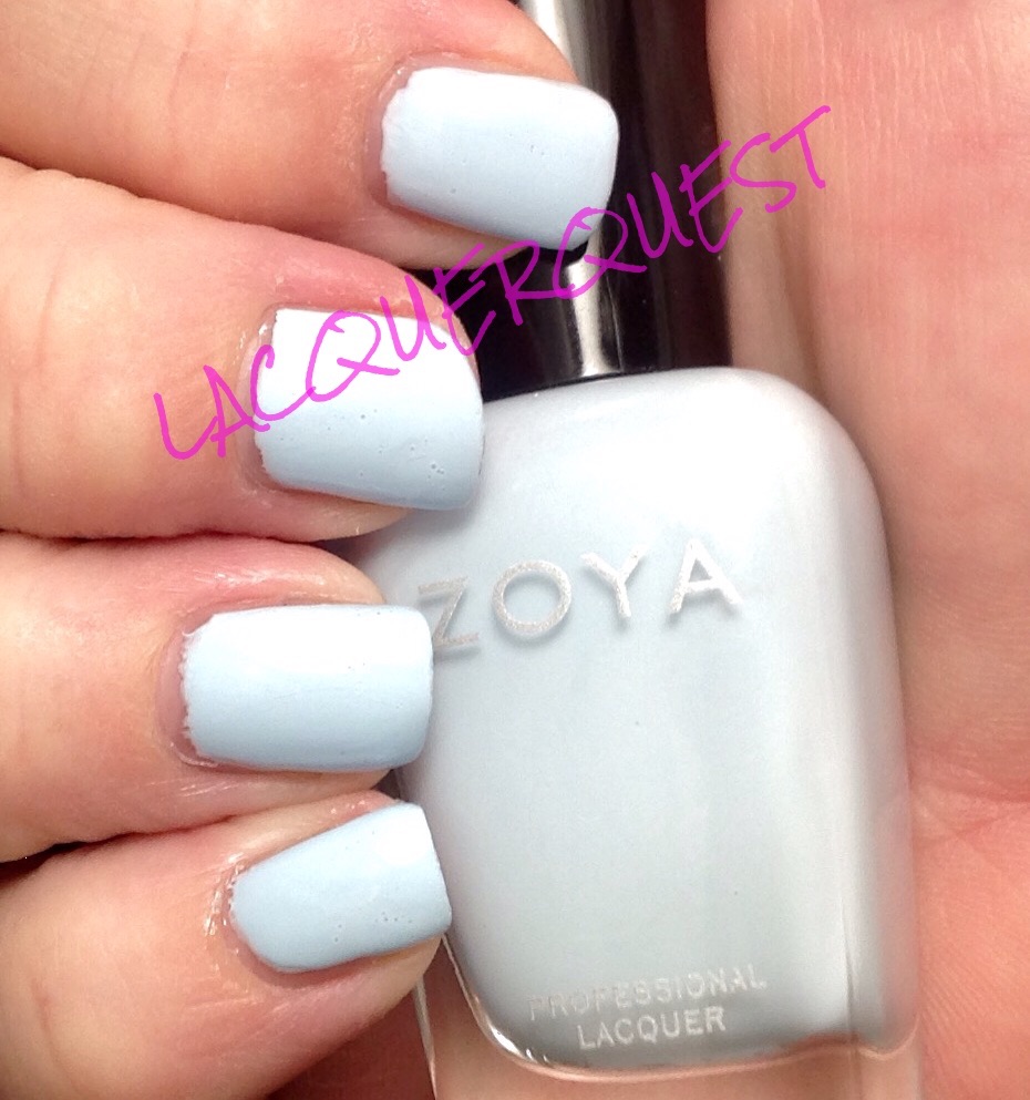
Yes, I’m finally getting to the one I sneak peeked a while back!  I have kind of a love/hate relationship with this polish, for reasons that will become evident…

Gargantuan Green Grape came out way back in 2005 in the Summer Brights Collection!  I actually had to look this up because I wouldn’t have taken this for a bright.  Then again, another one I have from that collection is Significant Other Color and that one is definitely not a bright, so who knows?  So GGG has been part of the core line forever, if you call ten years forever, which I do.  In the land of nail lacquer, that’s an eternity!  They brought this out in a matte version in 2009 back when everybody and their sister was gaga over mattes, but I avoid them like the plague so I don’t have any of those.

.Like most white based pastels, it’s a nightmare to work with this one.  It’s thin, streaky, patchy, you name it.  But I put up with it because I loved the color and there really wasn’t anything close to it, (I’ve since found alternatives, which I’ll go into below).  There are other mint greens, sure, but they were either too blue, or too dark, or had a shimmer, or whatever.  This was the perfect light mint green pastel creme!  Well, except for actually using it…..

Ggrape

“So what’s the problem?” you might say.  “Looks okay to me.”  Well, I’ll tell you.  For starters, you’re looking at six coats there, ladies and gentlemen.  That’s right, SIX persnickety, careful coats!  So six chances for everything to go terribly, terribly wrong.  For instance, you might notice that dent in the ring finger.  Yep that happened when I knocked it against a bottle on the end table reaching for the Seche Vite.  At that point, I damn sure wasn’t going to try to take off the polish on one nail to do over, because we all know in that way lies madness.  This happens so often that I finally faced facts and realized that I had to do something.  Options included:

  • Cleaning off the damned end table (I’ve tried that before, somehow it replenishes itself when I’m not looking)
  • Paying attention to what I’m doing when I’m reaching for something (Squirrel!!!)
  • Getting one of those grabby things from Sally to use with cotton balls so I won’t mess up the other fingers

I’ve always laughed at those things.  Like what kind of delicate flower needs an implement for a cotton ball so that their delicate little fingertips won’t get sullied.  It’s like people who use a bridge stick when they play pool.  Just swing the cue behind your damned back like a grown up and carry on with it!  Or using tongs to pull food out of hot grease.  Don’t be a baby, that’s what long nails are for!

Anyway, I didn’t get the grabby thing for a while, so I can’t promise there aren’t any more blemished nails coming up, but sometime after this I reached my breaking point and got one.  Behold!  So simple, yet so useful!  The only concession I’ve had to make is that I buy those big-ass cotton balls and the claw can’t contain all of their awesomeness at once.  So I have to cut them down, which makes them last longer. So all the better, I guess.

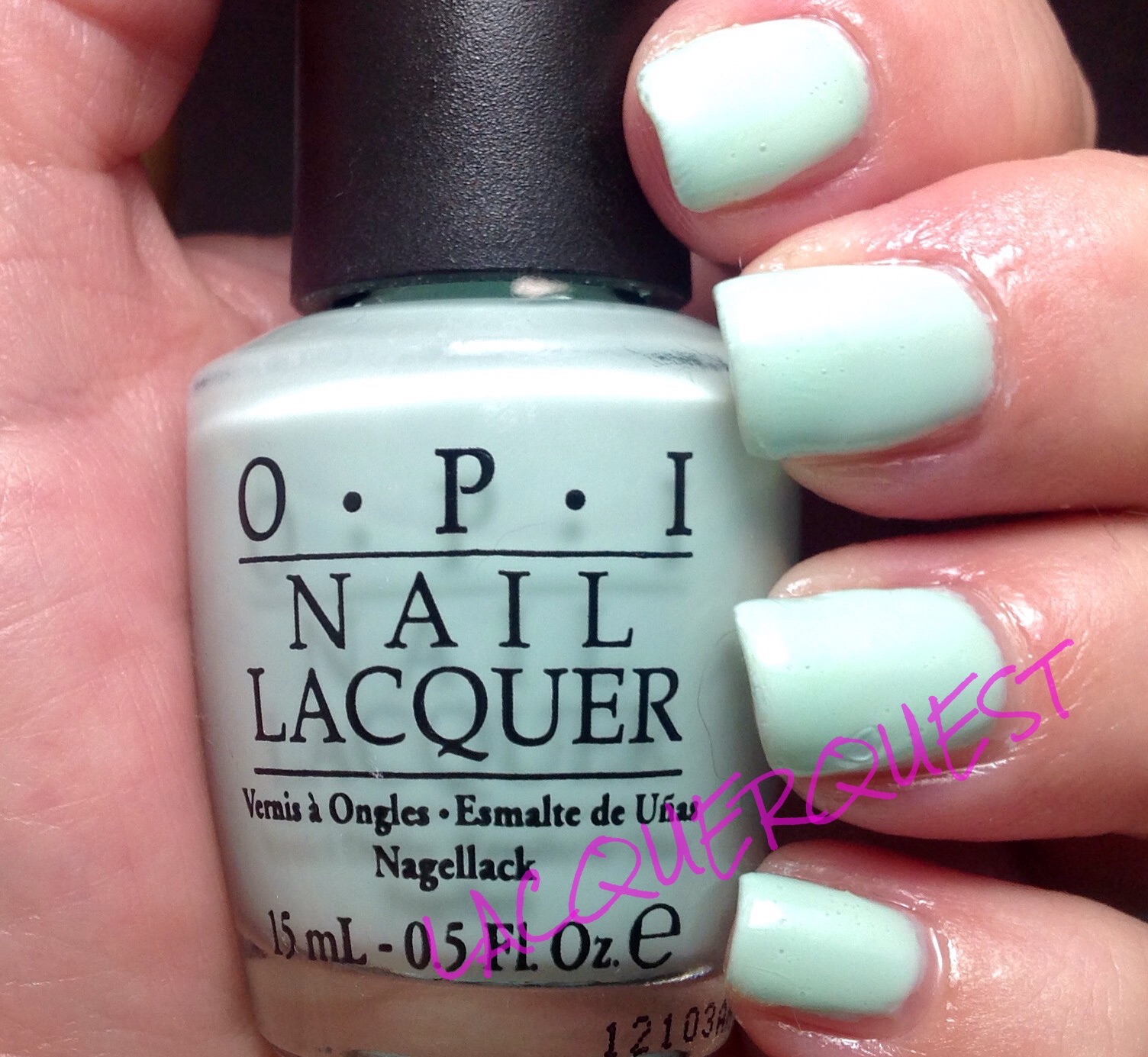
But, onward with the touchy little number that is Gargantuan Green Grape.  You have to be careful with the application.  It’s hard to get a good cuticle line as it’s prone to flooding, so it’s necessary to leave room for the Holy Ghost (it’s a Catholic thing…) and hope for the best.  And if you try to just brush it on, you could put on 33 coats and it would still be streaky.  Instead you sort of turn the brush horizontally and lay the polish down on the nail instead of just brushing it across.  But, the results were usually worth it, until….

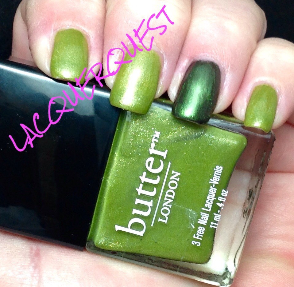
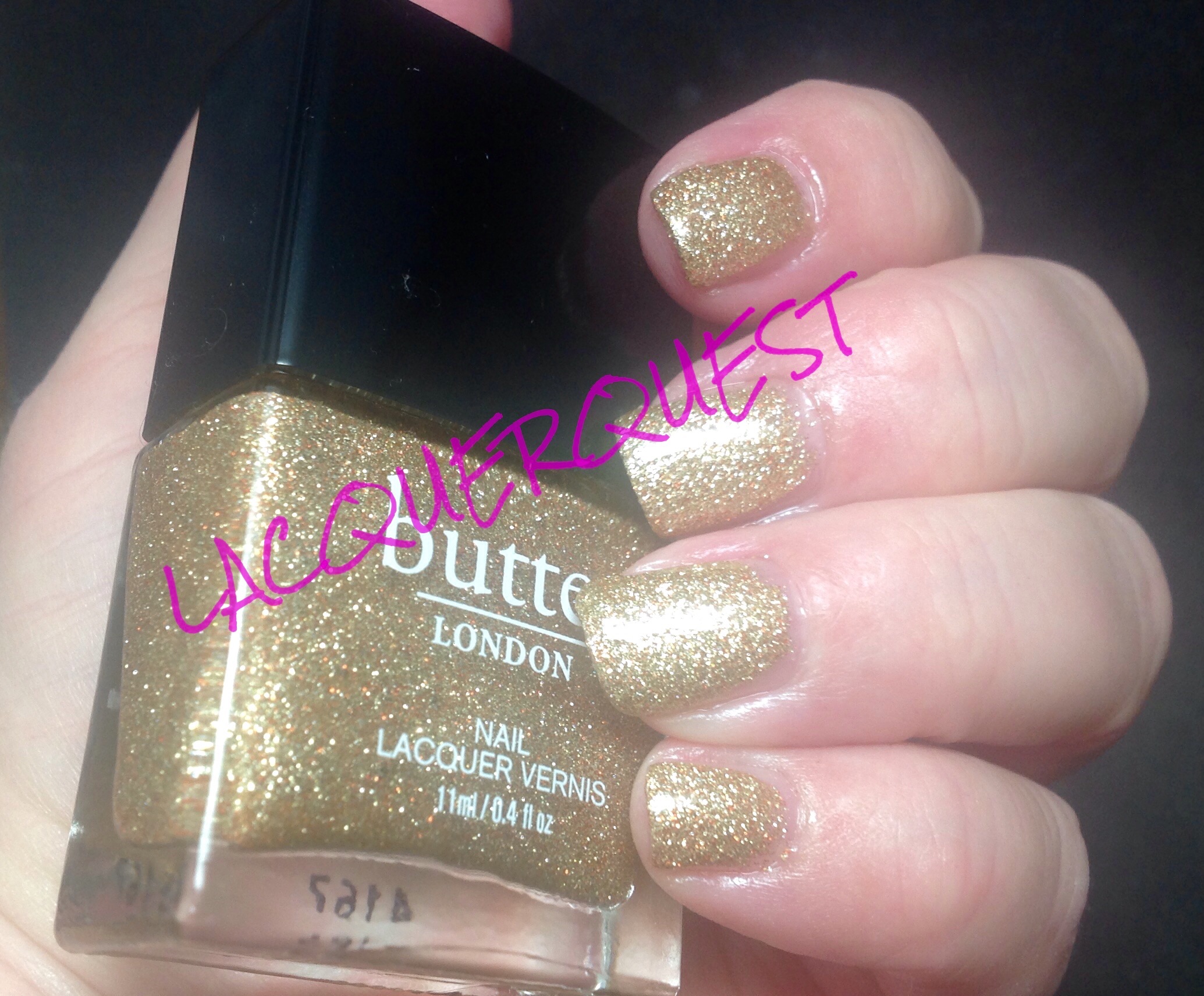
I got a butterLONDON polish called Fiver.  I’ve had it so long that I don’t remember the circumstances behind it, but I’m sure it was some kind of a sale (natch).  Then I got it home and compared swatch sticks and it looked just like GGG.  Damn!  I could have gotten whatever other color I was considering.  But I loved this one soooo much!  Everytime I love a color soooo much, I’m sure to have at least one, usually several, just like it at home.

However, while it’s not a perfect application (it is a white based pastel, after all) it’s a complete dream compared to GGG.  Good going, BL!  So that solved that.

Fast forward to this year’s OPI collection for spring, Hawaii, and I’m not completely thrilled with it, but they have one I really love.  That’s Hula-rious!.  Yeah, that’s highlarious, OPI.  But I wised up and decided the reason I like it is because it looked like GGG and Fiver.  Not going to be fooled again!  Then I got the mini set (my mini set addiction is worthy of a complete post of its own) and that was one of them!

Around the same time I also picked up an OPI base coat called Put a Coat On! on clearance at Sally that’s supposed to be used with brights and neons to intensify them.  It’s a solid white so I got it thinking it might help those multiple coat polishes that are such a hassle.  The following is the results of those labors.

image

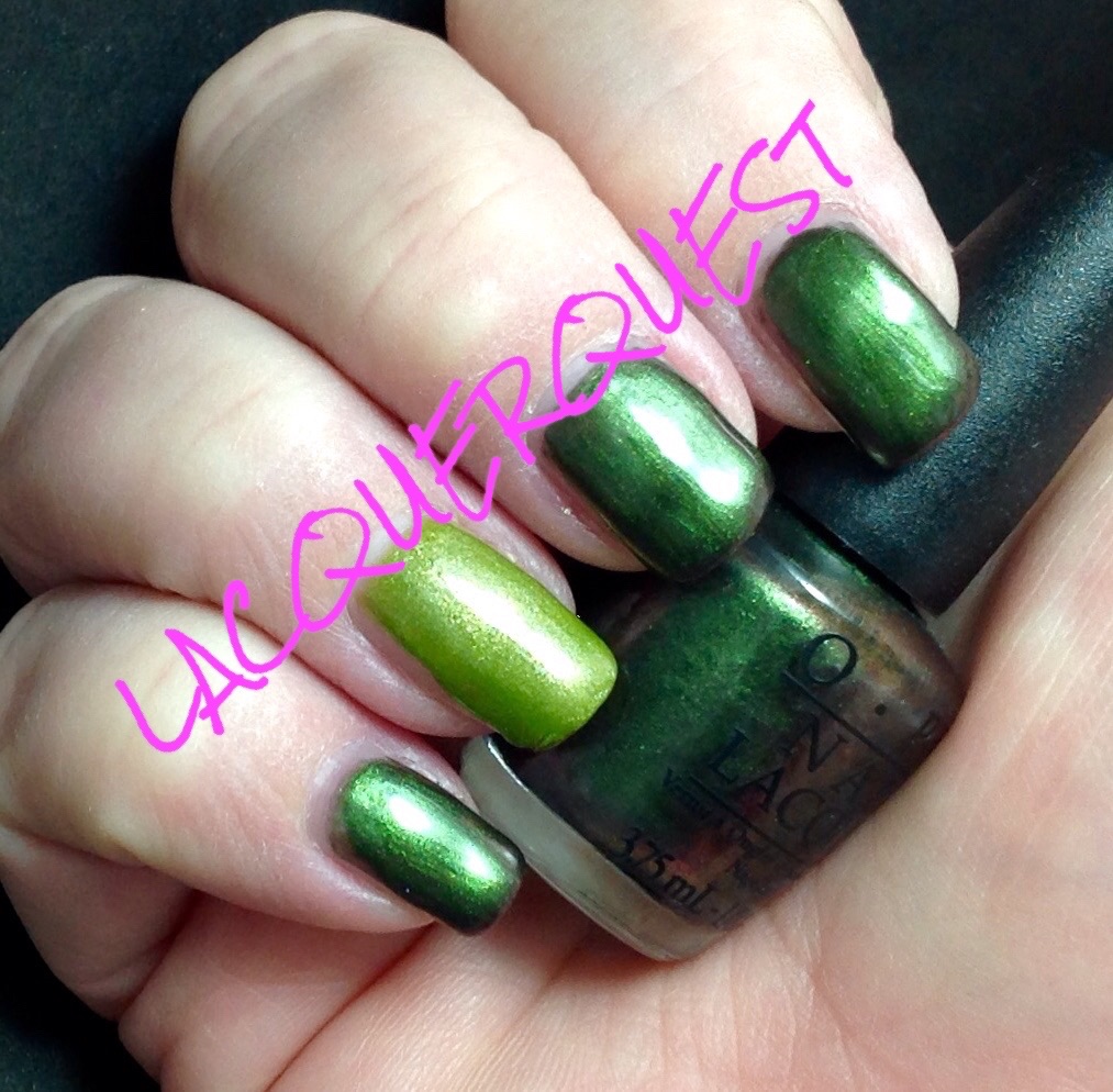
From left to right:  That’s Hula-rious!, Gargantuan Green Grape, Fiver.  As you can see from the bottles, Hula-rious is way different.  That also might be a reason that I didn’t like it as much as I thought I would, so the mini will do me fine.  The GGG and Fiver don’t look a whole lot alike, but maybe that’s because of the different bottle, because they’re a lot closer on the nail.  Observe….

image

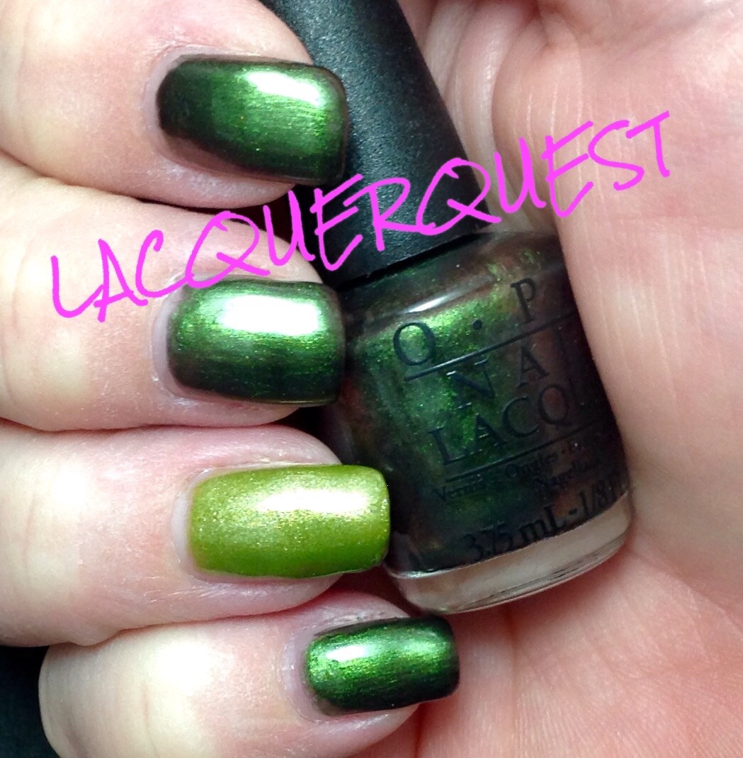
From index to pinky, that’s Fiver, GGG, Hula and GGG with the white base coat.  As you can see, Hula isn’t even in the same ballpark, much more yellow. So much so it makes the other look practically blue in comparison and they don’t look blue at all on their own.

The Fiver looks a skosh lighter in the picture than GGG (they’re practically  bang on in person) but that could be because that’s SIX coats of GGG to THREE of Fiver.  And I could have gotten away with two coats, but I did three on Hula so I wanted to have an even comparison.  Even with SIX coats, you can still see bald patches on the GGG.  To be totally fair, I didn’t top coat any of them and that might have helped.  I also didn’t baby it as much as I would have if it was going to be an actual mani.

I have to give a big pinky up! to Put a Coat On, though.  While it looks a little patchy in the picture, it didn’t seem that much in person.  Also (hold on to your hat), that’s only two coats.  TWO!  Had I noticed the patchy, I would have done another coat and I usually do three anyway.  As for the base coat, it was such a solid white that I thought it might go on like Liquid Paper.  No way!  It went on smooth as silk and was completely opaque in one coat!  I’m going to try it with some of my other really sheer but not necessarily patchy polishes to try and reduce the VNL.  Never mind that i have like half a dozen different whites for that purpose…..ha!

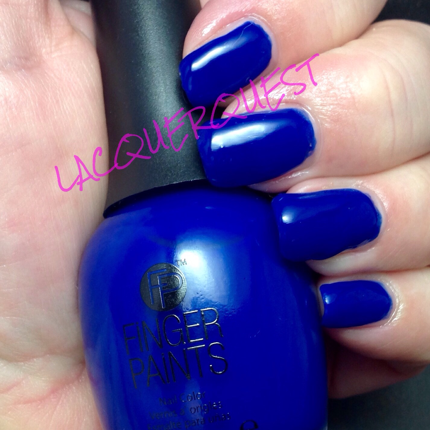
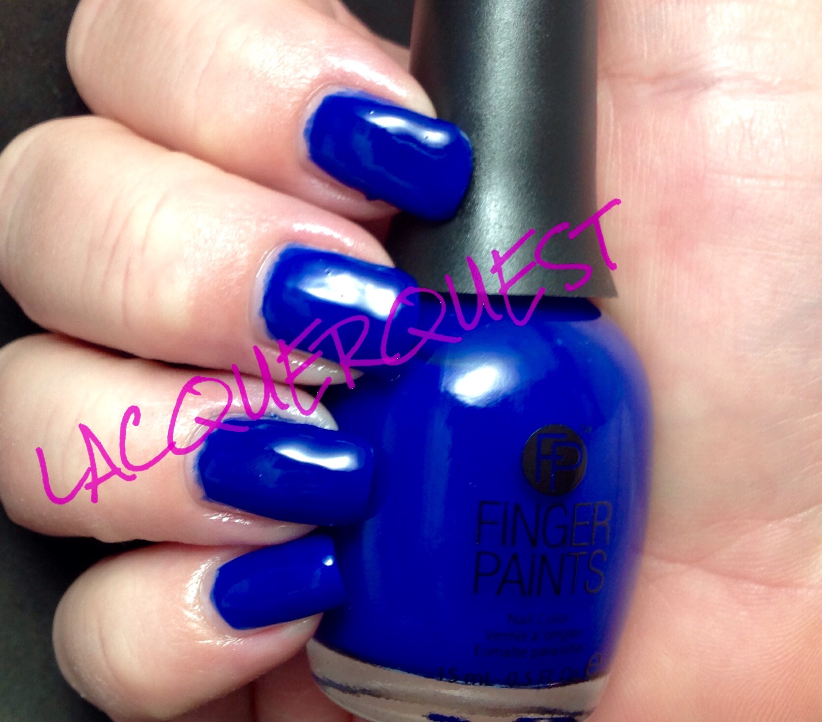
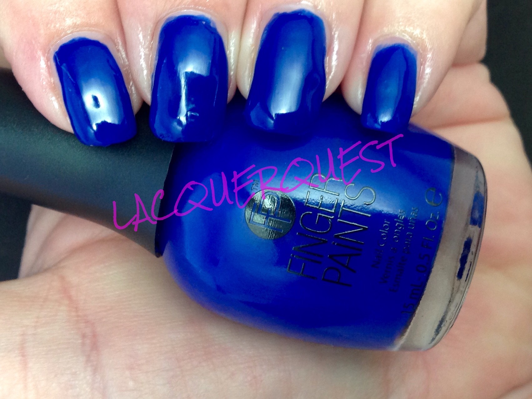
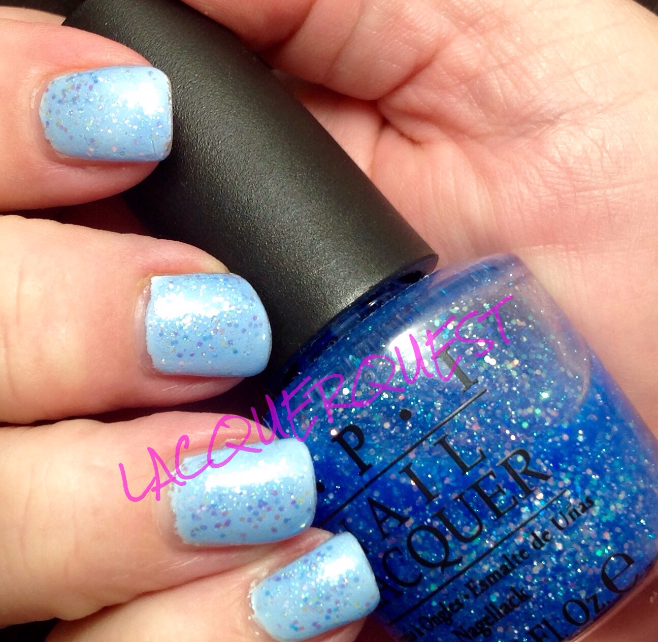
Speaking of green, I had what I thought was a pretty cool mani for St. Patrick’s Day so that might bump a few others back, just to be somewhat timely.  Yes, it irks me that St. Patrick’s color is BLUE, for God’s sake, not green!  And, yes, back in the day I was a smart ass who wore St. Patrick’s Blue and dared someone to pinch me.  But I’ve mellowed a bit since then and just go along with the masses these days.

But in looking through my to be posted manis just now, I do have one that could be deemed a nice St. Patrick blue that I had on shortly before this week.  Hmmmm….Maybe I’m still a rebel, just a subconscious one….

A Few Words on … Beauty Steals

So just last week I was thinking here it is almost the middle of March and I haven’t seen anything on Ulta’s semi-annual Beauty Steals promotion.  And then this weekend I get the newest circular with the BS (ha!) calendar!  I was so excited that I stood in the driveway and checked it out…

As an aside, what ever happened to the excitement that getting the new phone book generated each January?  Damn you, internet and your infernal immediacy!  That used to be a really big deal and I probably haven’t even opened a phone book in the last couple years.  I get two or three different ones every year and, when I finally toss them to be recycled, the spines aren’t even cracked.  Kind of sad, isn’t it?

But back to the matter at hand…

Generally, the only nail lacquer represented is butterLONDON, but I’m always hoping for a Zoya or OPI one.  Or even a CND Vinylux, since I really like a couple of shades in their spring collection, Garden Muse.  Hell, I might even check out some Orly or Essie on a BS!  But it’s still a BL-only world, so I’ll have to save my coupons for the others that I want.

So, BL fans, start your engines and circle March 19 on your calendars!  It’s so exciting!  Well, actually not.  Instead of the usual BOGO, it’s a flat $9.00.  Now that might actually be a better deal for some.  You don’t have to buy in pairs and it also covers nail treatments.  Those are usually $19 a pop, so that’s even better than 50% off!  However, I’m not even feeling a tiny bit of want on this one.  It could be because I still have tons of untrieds from my BL sprees last fall.  I even got a really good deal on cuticle remover/oil sets or I might go for some of the treatments.

For those wondering about the various treatments, I really can’t give much of a review.  The treatment products I have are the Melt Away Cuticle Eliminator, Handbag Holiday Cuticle Oil, Nail Foundation Flawless Base Coat and Hardwear PDQuick Top Coat.  Of those, I haven’t tried the cuticle oil or the base coat.  Once I run out of my current oil and base I’ll start using those, so a future review might be in the offing.  I’ve been using the Melt Away for a while now and, while I can’t say it’s appreciably better than any of the Sally Hansen ones I’ve used, I like it well enough.  But at 9 bucks, it’s only a few dollars more than the drugstore varieties and the BL treatments are in bigger bottles than the lacquers, so it might work out to the same or less per ml/oz than the ones in glass bottles with a brush.  Probably not the gel kind in a squeeze bottle, but I prefer the brush types so it’s worth it to me.  I will say I like it a lot better than Blue Cross remover, which is so thin it’s like water and just comes in a big ol’ plastic bottle with no applicator.  I have scads of the Blue Cross since it’s actually cheaper than water, so I started using it in the foot bath and went for better stuff on my nails.

I kind of banged on the PDQ top coat during my Seche Vite review, but I’ll backtrack a little on that.  All of my in use bottles of SV need some Restore and since I’m too damned lazy to do it when I’m thinking about it, I forget until my nails are wet and I pick up the bottle.  So I’ve been using the PDQ for my last couple manicures.  Is it as good as Seche Vite?  No way!  It’s not as glossy and it’s not as hard so you don’t get that satisfying click-click.  It also doesn’t dry as fast, but it does do a lot better than I previously thought.  I’ve been using it when I don’t have anything to do afterward except play on the computer with no typing involved.  If I needed to get up and go somewhere or have some activity right after, I’d still definitely go for the SV.

The only reason I have the base coat is that it came in a set, so it’s not that I’m dissatisfied with my regular OPI base or Seche Clear.  My OPI is really getting low, so I’ll probably switch to the BL after that’s gone and wait for a sale instead of replacing the OPI right away.  The cuticle oil was also in sets at a huge discount so I still had plenty of my other oils left.  I have a big bottle of Super Cheap Super Nail that I use when I want need a big oil drenching (like after my nails have been through an acetone soaking), but I’ve been using some Sally Hansen and Gelish as my daily oils.  Once one of those runs out, I’ll start on the BL.

Since I don’t have any pictures for this post, I’ll just give a random sneak peek at an upcoming BL polish:

All Hail the Queen with West End Wonderland accent

As well as a bottle shot of one of the cuticle oils that I’m currently using up before I start with the Handbag Holiday:

Polish is OPI I'm Not Really a Waitress

Polish is OPI I’m Not Really a Waitress

China Glaze – Grape Pop

Although I don’t always go in order of being used, I think that the pale green pastel is next chronologically.  But I took some comparison pictures with a couple of other colors that I want to include in the review and I haven’t uploaded them to WP yet.  So I’ll forge ahead and let something else take cutsies….

Grape Pop was in the China Glaze’s Spring 2010 collection called Up & Away.  It was mostly straight cremes of various candy shades.  I don’t know what that has to do with hot air balloons, but I do have a few from that collection and it was a pretty nice group.

This is a straight ahead purple creme.  If I had to pick, I’d say it leans blue rather than red, but it’s pretty much right down the middle.  While that might sound a little boring, it’s actually really great!

image

See?  It’s vibrant without being flashy, highly pigmented without being dark and one of the best creme formulas from China Glaze that I’ve come across.  See that beautiful coverage?  TWO coats!  That’s it!  Even me, the Original Three Coat Queen, looked at it after two and thought, “eh, there’s absolutely nothing here that could be improved by another coat”.

And while the color seems like something that I have at least a dozen similar shades, not really.  I’ll have to dig through because the few I compared just by bottle were quite different.  I have one Sally Hansen CSM (Good to Grape, maybe?) that I think might be close.  When I find it, I’ll compare.

If you want a candy coated purple that’s not too dark, not too light, that’s a straight creme with no shimmer, glitter or fleck of any kind, covers well and goes on like a dream, Grape Pop is an excellent choice!


Zoya – Blu

Blu was part of Zoya’s Spring 2013 collection called Lovely.  They really go for the pastels in their spring lines and that year was no exception.  As I remember, they had three cremes and three shimmers.  Not surprisingly, I preferred the cremes!  I think I got two of them and I really liked the third, Neely, but I already had at least three likely dupes, so I abstained.  I don’t know how many times I picked that up at Ulta and then remembered, “oh, yeah, I like this so much I already have half a dozen similar polishes”…ha!  I also have one of the shimmers (Piaf), but just because I got it on clearance and it was a vastly under-represented color in my collection.

So, Blu….  Surprisingly, it’s blue!  A gorgeous, light baby blue, even an exceptionally pale sky blue.  After the disappointment that was Avery, I felt it necessary to follow up with this one just to restore Zoya’s good reputation for killer cremes!  I think this picture is showing a bit lighter than it is in real life.

Blu


Now that my nails are starting to get back in form, looking at these older pictures is cringe-inducing!  But be stout of heart and hang in there because, as we’re so often told, it really does get better.  I also have a new cuticle regimen so those ragged polish lines have improved as well.

But, back to Blu.  For a light colored creme, this is an exceptional polish!  This is three coats, but I really do think I could have gotten by with two.  Just a few streaks on the first coat and, rather than it being too thin or chalky, it was on the thicker side. Not enough to be goopy, but enough to have really good control and fantastic leveling.

I liked it so much that I wore it for probably a week (which is unusual for me) and I freshened it up for a few days with a coat of OPI’s Last Friday Night from their Katy Perry Holiday Collection way back in 2010.  Yeah, it was a little bit beyond being capable of freshening….

Blu Friday Night


This is kind of a blue and pink-iridescent glitter in what I thought was a clear base.  But it does look like it darkened up the Blu a little bit (also this picture is truer than the previous one), so I think it might be a lightly tinted blue base.  I’ll have to delve into this more deeply when Last Friday Night gets its own review, but when I’ve used it by itself I haven’t seen any color change on the nail besides the glitter.  As you can see it’s more suitable as an overcoat, although I don’t recall it being marketed as such.

Zoya – Avery

Sigh… I’ve been dragging my feet on this one and putting it off because it pains me to do it.  So let’s rip off that band-aid and just get it over with, shall we?

Avery was introduced in Zoya’s Winter 2011 collection called Feel and is now part of the permanent line.  It was soft pastel cremes, which would seem more spring to me, but that might just be because OPI brings out their Soft Shades in spring and I’m used to that.

Avery is a nude yellow-toned beige.  I seemed to recall that I didn’t like this polish for some reason, but couldn’t remember exactly why.  It wasn’t the color because I like the color (even though I usually prefer a pink or grey toned beige).  I like it so much that I sort of bought it twice.  I think it’s a straight on dupe for OPI’s Don’t Pretzel My Buttons from the Germany collection.  I can’t compare because they looked just alike so I gave away the OPI.  Why?  Because Zoya and OPI both do great cremes and I liked the name of the Zoya better.  Bad move, as it turned out…

So what’s the problem?  You’re about to see it.  If you have pearls, be prepared to clutch them:

Avery

It’s the lumpiest, gunkiest, grossest polish I’ve ever seen from Zoya.  And it’s even more egregious coming from them, because they’re usually so good!  I expect crap like this from cheap dollar polish from the drugtore, but Zoya??  Come on!  I don’t think it’s even necessarily the Feel collection itself because I have at least one other polish from that collection (Kennedy) and I have no problems with that one.

I even used this in a manicure a few months ago, but it came out so crappy that I thought it might be operator error and deleted the pictures and put it back in the To Be Tried.  So, when I recently did the right hand with China Glaze Angel’s Breath and it turned out horrible, I decided to just go ahead and do the other hand with Avery because it was no big deal if it came out bad because I was going to re-do my right hand, anyway.  And, as you can see, bad it did come out….

But wait!, you might say, this could have been operator error as well.  Perhaps your nails weren’t smooth and clean.  Perhaps your base coat was bad.  Perhaps you were tired by the time you got done with the travesty on the other hand and just didn’t do a good job of it.  Perhaps there was a full moon combined with a neap tide and the barometric pressure was dropping at the same time.  Yes, you might say that.  But I would counter with, “oh contraire, mon frere!”.  Here is the same hand right after I finished the manicure that immediately followed the removal of the Avery’s Angel Breath mess.  A manicure accomplished with a finicky white-based pastel, I might add.  Observe…

(Bonus sneak peek at an upcoming review manicure!)

Ggreen


Sorry, Avery, you’re going in the sad face column and are a prime candidate to be Wallflower of the Year.  Oh, who am I kidding, I’ll try it at least once more (probably after the next epic nail breakage) just to make sure.  Because you are Zoya, after all…..

butterLONDON – West End Wonderland

Well, well, well…here we are again.  Oh, Butter London, I just can’t quit you…  I’m going to keep using you until I love you, dammit!  Truthfully, I’m almost there, at $8.00 or less, anyway.  I got this one in a Holiday two-pack that was half off the regular price and then I got 50% off of that.  Butter London at $3.75 a bottle?  Yes, please!

West End Wonderland is a light gold glitter in a clear base.  I’m not really a fan of gold in general and gold nail lacquer even less.  But this always looks so tempting that it’s been on my “maybe” list for several years.  When the aforementioned deal came up (the other one in the pack was Come to Bed Red, which is another one that’s been on that list for a while). I finally took the plunge.

And I’m glad I did.  It looks pretty dark on the BL site, but in person it’s much lighter and brighter and even has a sprinkling of sparkly copper and pink!

West end wonderland


Here’s another shot to show how delicate it looks when it’s in the light:

West end wonderland1

Like most clear glitters, it goes on quite sheer.  In fact, I think that a light coat of this would be a great topper to a creme underneath.  Unlike a lot of clear glitters, it was perfectly opaque after three coats. It also came off really easy, not just swipe, wipe like with a creme, but it didn’t require soaking, either.  Also like most glitters, it wasn’t perfectly smooth but just one coat of Seche Vite fixed it up nicely and, since I always finish with the SV, it wasn’t even an extra step.

Will I wear this all the time?  No, because even though it exceeded my expectations I’m still not a real fan of gold glitter.  Will I wear it again?  Yes, it’s easy to apply and easy to remove.  I might even try it as a topper for some sort of holiday manicure come December.