OPI – I Have a Herring Problem

The two big deal OPI collections are the geographically themed ones for spring and fall (that actually come out a couple of months prior to the start of the season).   They have other collections they do every year, most notably the holiday and summer collections.  These have varying themes, most often a movie tie-in or a celebrity (their most recent celebrity is Gwen Stefani), but the spring/fall big guns are always centered around a geographical region.  Probably some of the hype over these is created by speculating on what city/state/country/region will be next.

The last couple years these collection have been a little hit or miss, but back in 2012 they were still going strong and the spring Holland collection was no exception.  There might have been a slight clunker or two, but no real flops and the collection as a whole was fabulous.  I probably have close to half a dozen of the Holland polishes and this is one of my favorites from that group.  I really don’t wear it that often, although I don’t know why.  That’s one of the fun parts of the Quest, discovering some real gems that I’d forgotten I even had!

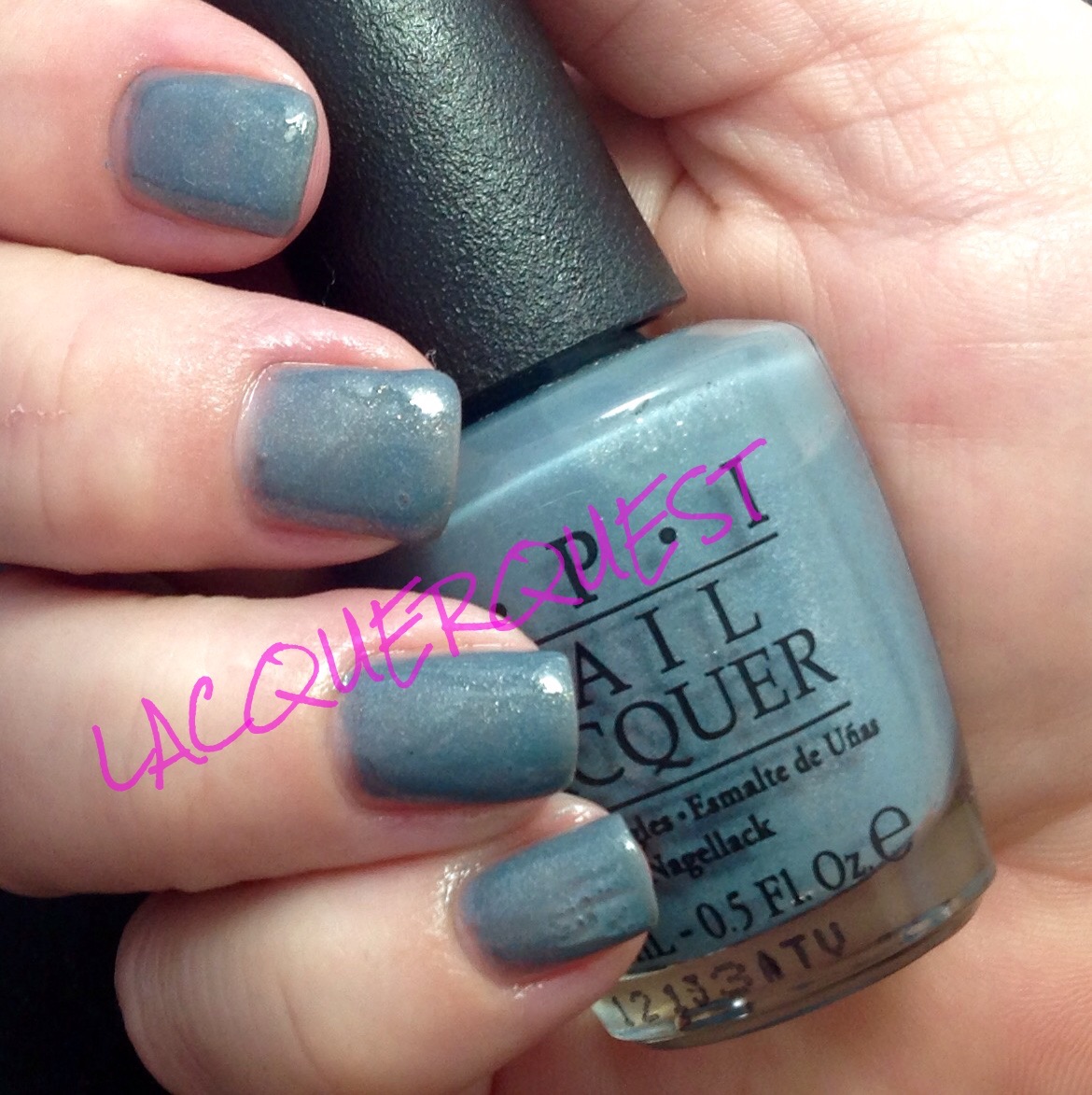
I Have a Herring Problem is a medium, dusty blue with an understated shimmer of gold and silver.  Although it’s not even slightly teal, the blue leans green as opposed to gray (more on this in the following paragraph).  It’s a very wearable color, as the blue is about as close to neutral as blue can get and the shimmer is just a hint, rather than screaming GLITTER!!!!1  It was a bit on the thick side, but I think that was just due to the shimmer packed in there rather than it just being a straight creme.

Herring1


I really biffed the little finger on this hand, but I’m showing it anyway as you can see the shimmer a little better:

Herring

There is another shade in this collection called I Don’t Give a Rotterdam that, on first glance, looks just like Herring Problem.  I ordered them online and couldn’t decide between the two, so I got both (of course!). It’s funny, when you hold the bottles in separate hands they look identical, but when you put them together…

Herring Rotterdam

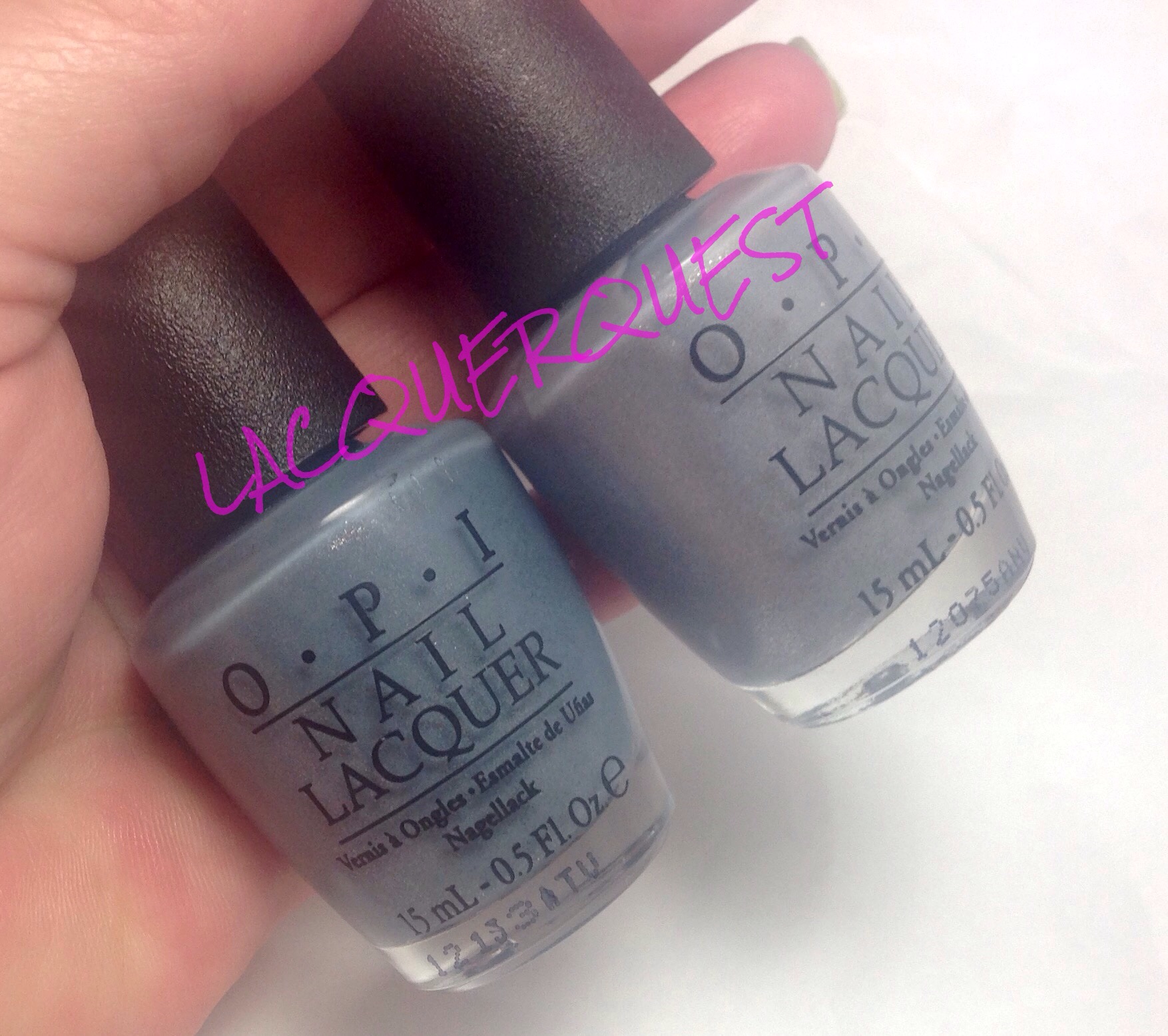
That’s Herring on the left and Rotterdam on the right.  See what I meant about the green in Herring?  You don’t even notice it until you hold it next to the slate blue Rotterdam.  In fact, I would have described Herring as slate blue before I compared the two side by side.  I think that Rotterdam also just has silver shimmer with no gold, but I can’t tell for sure until I actually brush it out.  When I do the Rotterdam manicure I’ll try to remember to use Herring as an accent nail in order to have a side by side comparison on the nails.

Here’s something else strange about these two; when I was looking for Rotterdam in order to compare, I couldn’t find it.  The label with the name has fallen off of the bottle and I kept picking it up and saying “no, that’s a gray shimmer”.  After I’d gone through the entire box of OPI I broke out the swatch sticks, compared and, sure enough, that “gray” was Rotterdam!  It didn’t look blue until I held it next to Herring.  Colors (and our perception of them) are weird….


Advertisement

butterLONDON – Queen Vic

I have a somewhat rocky relationship with Butter London, which I expounded in a somewhat blistering fashion in a previous BL review.  But I’ve been on a bit of a BL spree in the last several months, what with BOGOs at Ulta and 50% coupons off of already reduced last orders on their website.  In spite of myself, I’ve begun to love it.  I still don’t love it $15 for 11ml worth, but I really love it at $8.00 and under…

This is Queen Vic, which BL calls a red wine/cranberry creme.  I only had a few BL cremes in my collection previously, but I’ve gotten quite a few more with my latest acquisitions.  For the most part I’ve liked them, I find them better than China Glaze, but not quite up to OPI standards.  I’d put them just under Zoya, which might be attributed to the brush.

Queen vic1

I’d classify this more as a berry than a cranberry, which I think of as more red.  Maybe red wine/dark mauve as it does lean just a taste purple.  I find it very close to OPI Anti-Bleak from their one of of their Mariah Carey offerings a few years ago or Casino Royale from the Skyfall collection.  Also Got Cherried Away from the Coca-Cola collection, which I actually have.  I’ll need to remember to do a comparison when I get around to reviewing that one.  Or maybe Zoya’s Veronica.

In other words, there’s nothing unique or special about the color.  Well, I shouldn’t say not special, because the color itself is a great one.  Probably why there are so many variants of the shade available.  Work appropriate but not boring, understated but not granny-ish, attractive on just about every skin tone and any nail length.  In other words, a pretty classic shade and one that I’m quite fond of in general, not just in nail varnish.


China Glaze – Escaping Reality

I think this might be the last one from my “old” batch of pictures before I cut all my nails down and went on hiatus.  But never fear, I’ve been busy making new ones!

Remember that movie Cirque du Soleil: Worlds Away that came out around Christmas of 2012?  Yeah, me neither.  But China Glaze apparently thought so highly of it that they did an entire full size collection devoted to it as a tie in.  Remember that 2012 holiday collection from China Glaze called Cirque du Soleil:  Worlds Away?  I do, but just barely and vaguely at that….

But, after brushing up on it in preparation for this post, it did have a couple of cool glitters that I liked.  But I find it physically impossible to pay full price for China Glaze (as reasonable as it is for a salon brand) and there were only a handful of cremes left when Sally finally got around to clearancing them.  So I ended up with two of them, a coral whose name escapes (ha!) me right now and this one.

Escaping Reality is a hot pink that borders on neon.  If it was a brighter or lighter shade it could very well go neon or fluorescent, but the pink is a darker blue leaning shade that saves it from being too loud and makes it much more wearable, rather than just being a “just for fun” choice.  I still classify it as a “hot” pink because it’s highly pigmented, plenty bright and not at all soft.

China Glaze Escaping Reality

As far as the formula goes, it was a bit on the runny side for a creme but I didn’t have a problem with any cuticle flooding.  It wasn’t even necessarily that patchy but since I like to do three coats anyway, that doesn’t really work against a polish for me.  Unless it’s one of those that you’ve still trying to even out half a dozen coats into the thing!  While it wasn’t exactly a matte, there wasn’t much shine to it, but a coating of my precious Seche Vite fixed that up and left my nails looking creamy smooth and ultra shiny.

I also added an atrocious attempt at some tiger stripes at some point before I removed it.

China Glaze Fingerpaints Charcoal

Although I’m far from the best nail artist in the world, I can usually do a pretty decent animal print, so I don’t know why this is 1.  so amateurish and 2.  why I took a picture of it.  Since I’m holding a FingerPaints striper in the picture, I’m pretty sure that I’d just gotten the stripers and….. wait!  I do remember!  Sally was having a B2G1 sale on FingerPaints stripers and I got those at the same time as the two China Glaze polishes!  Since it was the first time I’d gotten the FingerPaints brand of stripers I was testing one out while sitting on the couch with just a shaded lamp for a light source while chatting away with my sister.  Now that I remember the circumstance, that striping job turned out pretty well!

The striper was Ch-art-coal Black and is a really nice one.  Granted, my only other stripers are Salon Perfects that sell for a buck or two at the drug store but FingerPaints are definitely my favorites.  The brush is very narrow, but really long with flexible bristles and a nice point so you can get really thin lines as easily as thicker ones.  The polish itself is thin enough for a light touch and good control, but not so runny that it will drip and spread.  It’s pretty much like a nice fluid eyeliner, it goes where you put it and not where you don’t.

Nail Art – Little Mermaid Party

This really isn’t nail “art”, but it best fits this category because it isn’t a review and the manicure was put together for a specific look and occasion.

The occasion was my niece’s first birthday party and it had a Little Mermaid theme.  I could have gone all fancy with iridescent fish scales and some black outlines, but I didn’t actually do it until the night before.  So the plan was to use the Mermaid colors of purple and teal with some of the same colored glitter and sparkles on top.  But did I have four different lacquers in the appropriate colors that would work together?  What a silly question….

Mermaid teal

Mermaid Belinda payton


The base color for the right hand was OPI’s Ski Teal We Drop, a dark teal creme from the Fall 2010 Swiss Collection topped with Art You Wondering, a turquoise/teal micro glitter in a clear base from FingerPaints.  This was also the accent nail on the left hand.

The left hand was two colors from the Zoya 2013 Zenith Holiday Collection.  The base was Belinda, a dark purple metallic while the topper was Payton, a jelly with a slight holo that was more of a violet purple.  The accent nail was teal, to match the other hand.

I really like how it turned out, so much so that I might use the same colors for a straight on manicure.  But I’m still going to get more advance notice for this year’s theme so I can top this one!


OPI – Big Apple Red

Big Apple Red made its debut in the New York Collection way back in 2000 and has since become a classic in the line.  It’s easy to see why, it’s a classic middle of the road red, nice opacity and shine and, of course that famous OPI smooth as a dream creme formula.

But it enough?  I don’t know.  I’m on a perpetual search for The Perfect Red.  Although red is one of my favorite colors, I don’t really wear a lot of red polish.  I think it’s because for so long there weren’t many options in nail varnish and red was pretty much the default go-to.  Plus I can’t wear red unless my nails are fairly long because short, stubby nails + short, stubby fingers + red polish = man hands.

So, while Big Apple Red was the closest for quite some while to my dream red, it wasn’t quite there.  And I only have it in a mini because I couldn’t quite commit to a full size bottle of a color I don’t wear that much when the search was still on.  That’s also why the bottle shot shows Seche Vite instead.  The mini is too small to really show but a bottle is something to hang onto so you don’t relapse into Claw Hand.

OPI Big Apple Red

As you can see, this was one of the 70% of times that I forget to wrap the edges.  Pro-tip:  If you’re wearing red, make a real effort to remember to make it the 30% that you remember to wrap because it’s a lot more noticeable than with a lighter color!

What keeps this from being The One?  It’s a nice clear, true red but I think it leans just a skosh blue.  And, while I’ll take a red that leans blue over a red that leans orange every day and twice on Sunday, it’s not The Perfect Red.  I’d also like it to be just a tad more squishy, like a crelly rather than a straight creme.  But, it’s shiny glossy and fabulous so I highly recommend it for someone that isn’t as picky as me.

I’ve since gotten a couple of candidates that just might be The Perfect Red, but I need to compare them head to head.  I think at some point I’ll do an entire post consisting of the Tournament of the Reds.  I’ll need to wait a bit longer until my nails grow out a little more so I can go all Dragon Lady Style with it and quite possibly crown an Ultimate Grand Supreme Empress of the Reds!


China Glaze – Sweet Hook

This color was first introduced in the Spring 2012 Electropop collection.  With a name like that you’d think bright, flourescent, maybe even neon, but  the majority of that collection was pastel creme and we will be re-visiting Electropop a few times during this journey, since I’ve got several of those cremes.

I was fairly certain that this was now in the permanent line.  I looked it up to make sure and, unless they’ve changed this color with it went stock, the shade that China Glaze shows for this one is really off.  It’s showing a medium-dark lavender and the original is a light, pink leaning lilac.

I’ve got a couple of really rough looking spots on this one (did I not even look at these before I uploaded them?), but the color does show true, so I’m going with it.  Just imagine that index nail had a meteorite fall on it just before the picture was taken.

China Glaze Sweet Hook

This shows my why (as I’ve mentioned before) I’m sort of meh on China Glaze.  Nice color but nothing spectacular.  Not a great formula, but not really awful.  And that’s pretty much China Glaze.  Not bad enough to avoid it like the plague, but not good enough to seek it out and reach for it over something else.  I’m probably somewhat spoiled, as I have a lot of OPI and Zoya, who are masters of creme formulas and colors.

But Sweet Hook does have something that makes it one of my favorites and has me overlook the formula being a bit thick.  This is one of the most complimented shades I wear, especially from the men.  You’d think they’d go for the sexy, vampy stuff, right?  Whether it’s just the shade itself or it just looks good with my skin tone, there’s something about this otherwise innocuous nail polish that makes people notice it and remark.  And, hey, who doesn’t like a little positive reinforcement when it comes to their manicure?

FingerPaints – Art Nouveau Nectarine

As promised, I’m attempting to get back on track with stuff that I’ve let slide during the last 9 months when life got in the way.  I’ve got a couple old ones to get out and then it’s time to get on the journey of getting my nails back into shape.  Since I cut them all off about 6 months ago, I’ve had maybe a cumulative month to six weeks where they’ve looked decent.  I’m now experimenting with some gel bases and different cuticle stuff, so that will be a journey all its own.  So far, I’m pleased with how it’s going, but that worm could turn at any time….

I only have a few FingerPaints, and that was because with a combination of a sale/coupon/total purchase % off, I ended up getting them for like $2 each.  As such, I don’t know a whole lot about the line except that it’s exclusively at Sally Beauty and apparently their conceit is that all of the polish names are “arty”, much like Zoya does the girls’ names thing (although that’s getting strained lately).

I was never really interested because I figured it was basically a glorified house brand a few steps up from Wet ‘n Wild and why pay China Glaze prices when I could get Sinful Colors or Salon Perfect for a buck or two at the drugstore?  I am glad I took advantage of the afore-mentioned deal, because I really do like the polish!  Although I have only added one bottle and a few stripers (I think I might have had these before I got any lacquers) to the four bottles I originally purchased, it isn’t for lack of trying.  I took I don’t know how many trips to Sally trying to get a few of the last couple collections and the ones I wanted were always sold out!  But it’s likely that there’s a FP or two in my future the next time there’s a BOGO or some equally ridiculous sale.  Now, onto the review!

Art Nouveau Nectarine is a color in the standard FP line.  I should have thought more about the word nectarine, because I was really looking for a peach and this is kind of a dark peach with a touch of orange, which I guess is kind of what a color called nectarine should be!  So, it took a while for me to actually use it because it looked too orange on my swatch stick.  However, I’m happy to report that the orange didn’t really translate that much to the nail.

Fingerpaints Art Nouveau Nectarine

You can see that it’s not a pure peach, but what saved it was how juicy it looked, like it was a solid jelly (it isn’t, just a plain creme).  I also didn’t realize how crunchy my cuticles were looking when I took that shot.  Who says that fancy retina pixels and super close up is a good thing?  I also don’t know what’s going on with the tip wear on the index nail, as I don’t remember having any wear issues and didn’t think I waited long to take a picture but it was over six  months ago and I’ve slept since then.

After a few days I was tired of it (as I usually get after 2-3 days), but either didn’t feel like or didn’t have the time to do a new manicure, so I freshened it up with a coat of Colorful Collage!

Fingerpaints Colorful Collage Nectarine

This is a standard glitter in a clear base with a borealis type color of silver/blue/pink.  I’m not going into an in depth review on that, as I want to do separate reviews for the glitters and sheer holos with a variety of looks.