FingerPaints – Magritte’s Masterpiece

Wow, it seems like it hasn’t been but a month or so since my last post and….  What?  It has been a month since my last post?  Damn.

I could blame time or conflicts or ennui or just plain laziness, but I suppose it’s a combination of all three to a degree.  I’ve also been kind of bummed even thinking about nail polish since I had a nail break right before Easter.  Well, of course they all started following suit like lemmings to the sea and, once the third one bit the dust I had to uphold my two broken nails per hand limit and burn the village to the ground and salt the earth.  Welcome to Stubbytown, Population 10.

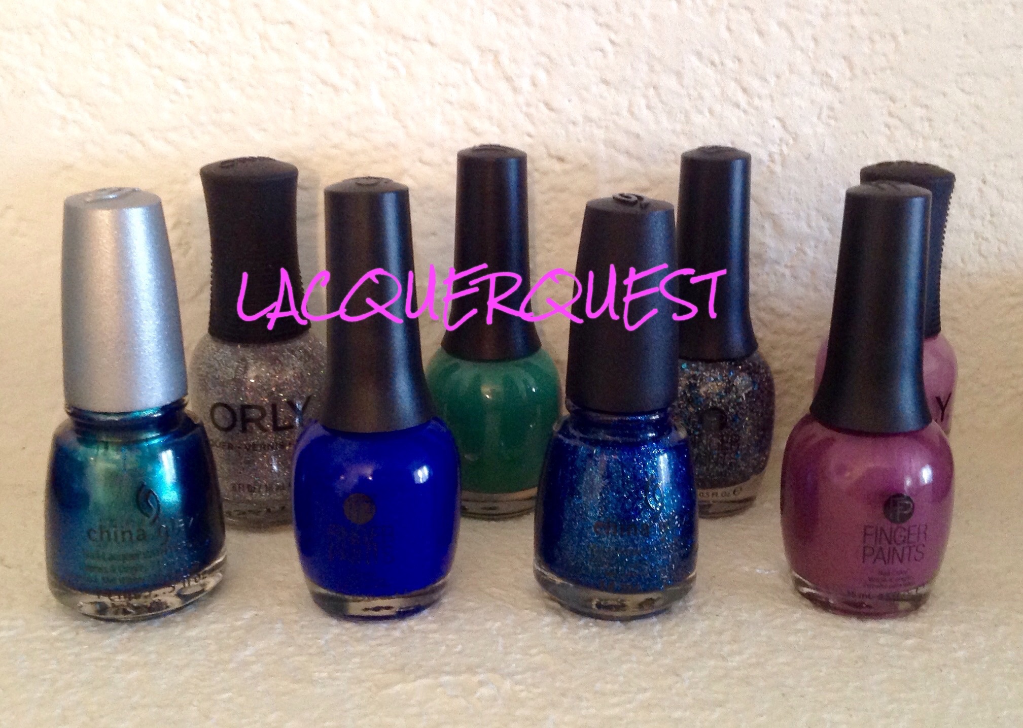
So no new manicures for several weeks now other than applying the lacquer equivalent of bandaids in order to once again rock the mannequin hands.  I also had to put the kibosh on the fancy mani that I had planned for my birthday next week, can you imagine such a tragic turn of events?  Luckily, I have many pics and review notes in the can already so I will have to look at this as an opportunity to get caught up on things.  As they say, when life hands you lemons just find someone to who/m life has handed vodka…

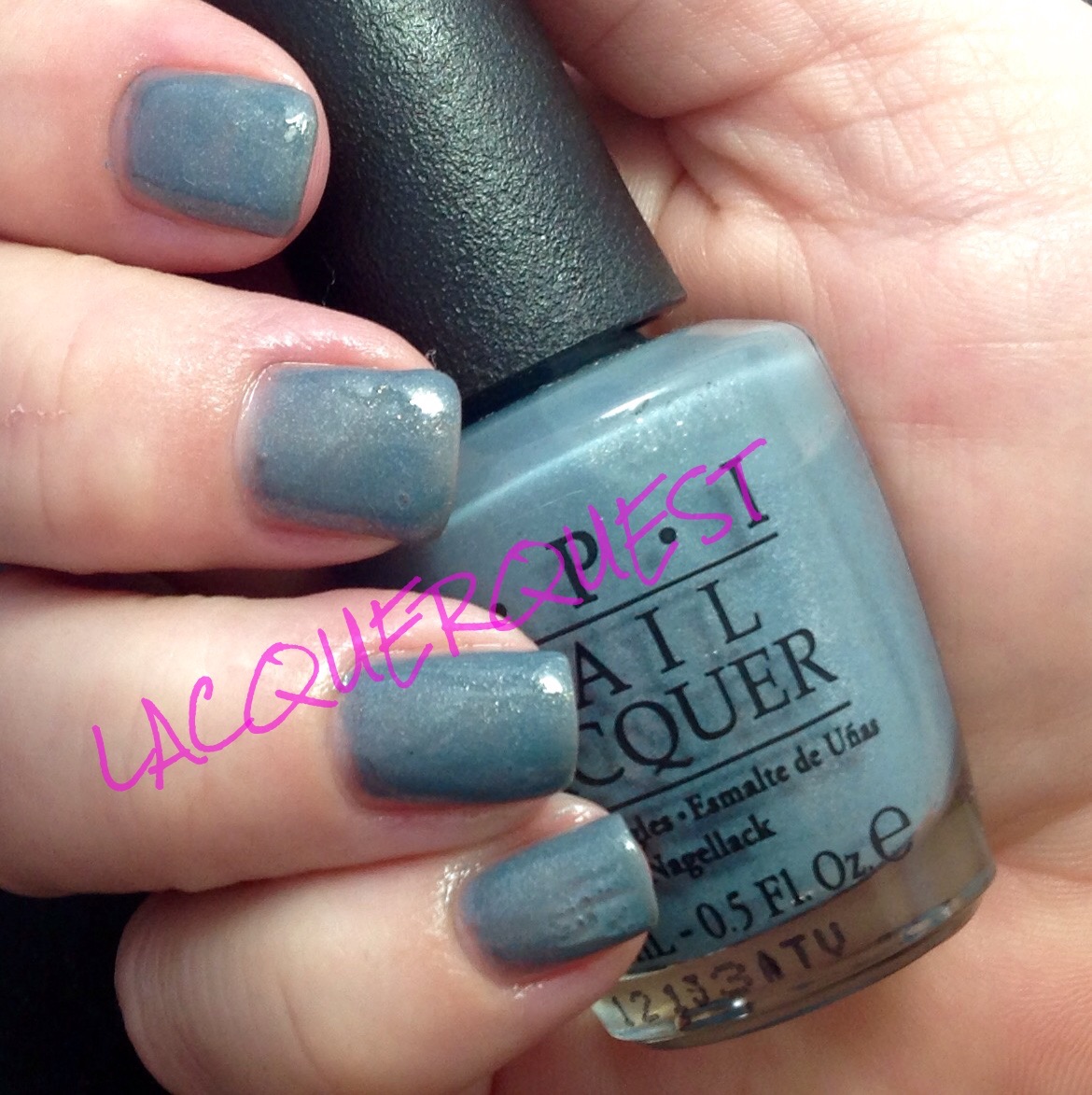
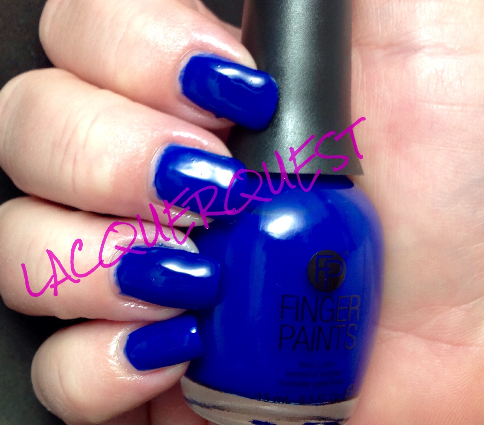
So, Magritte’s Masterpiece!  The polish I was wearing when the first domino fell and set off the sad chain of events to which I just referred.  I don’t blame the polish, I still love it dearly!  I didn’t notice until I was comparing photographs that the name on the label is actually MaRgritte’s Masterpiece.  I have to think that this is a typographical error since FingerPaints’ conceit is an artistic theme to their color names and that it’s supposed to be Magritte’s.  Even if it’s not and the spelling is intentional, I cannot deal with it and it will be forever known to me as Magritte as in Rene.  Not that I’m much of a fan of his work, and you’d think a polish with this name would be apple green, but a rose by any other name, yeah?

I’ve spent I don’t know how much time and money over the years searching for a true cobalt nail varnish.  Consequently I have more dark blue nail polish bottles than a person who doesn’t necessarily even like the color dark blue should own.  I have several that are described by the manufacturer as cobalt and at least one that is actually named Cobalt!  But, no dice.  Maybe I don’t really know what color cobalt really is (which we’ll revisit when I review Crimson), but by a true cobalt I mean that I want a polish the color of cobalt glassware.  You know, deep but not flat blue with a hint of red to it.  Not enough to see red or even enough to be a blurple, but just enough to make it glow from the inside.

So for the record, nail polish makers, I do not consider the following to be a true cobalt:

Navy blue

Dark blue metallic

Blurple, jelly or otherwise

Navy blue shimmer (it’s still navy blue)

Dark blue with glitter or a holo (I love a good holo, but it’s not cobalt!)

Then I’m browsing through the BOGO sale at Sally and end up just grabbing this one because I’ve been standing there forever and they might be ready to call the authourities because they think I’m casing the joint.  I don’t have a lot of expectations for it (I’ve had so many hopes and dreams dashed upon the jagged rocks of the nail lacquer display in the past), but whatever because I managed to pick up China Glaze Dorothy Who that I’ve wanted forever so yay blue!

So imagine my shock and thrill when I get home and try out my new purchases and there it is!  My Holy Grail!  My white whale!  My whatever was in Marsellus’ briefcase in Pulp Fiction!  The perfect cobalt!!

image

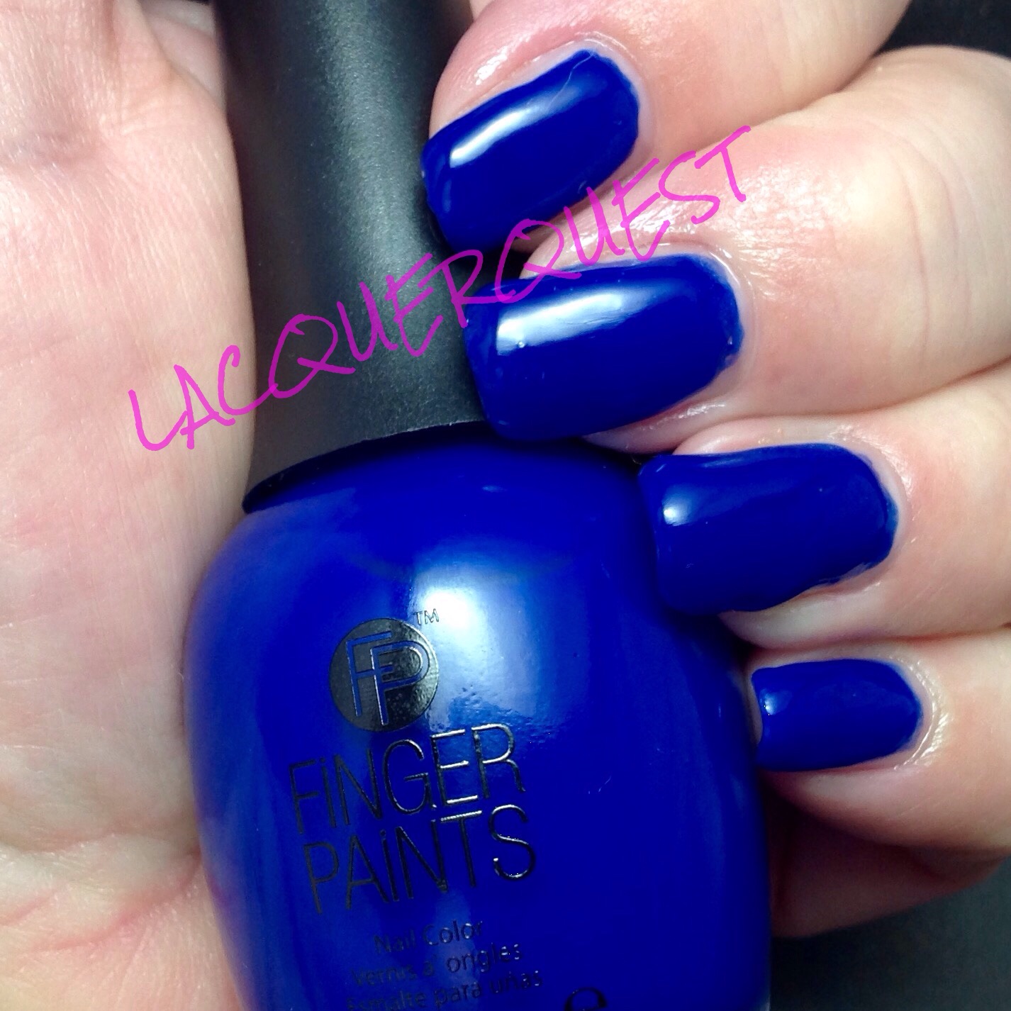
See why I didn’t have too much expectations just looking at it in the bottle?  It’s not quite dark enough and a bit too flat for true cobalt, but once on the nail….

image

Isn’t that sweet?  Want to see it again?

image

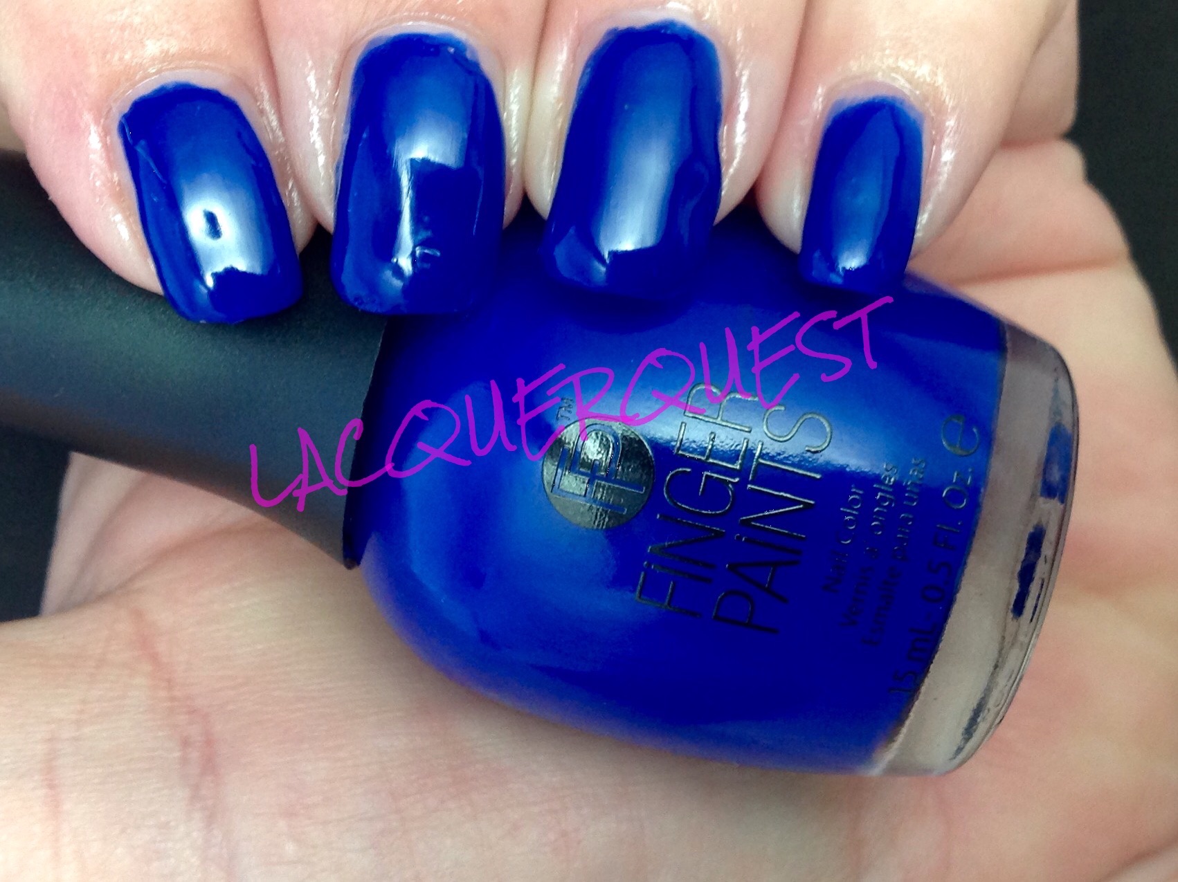
Oh yeah…. now that’s what I’m talking ’bout……

image

This was three glorious, silky coats.  Like a lot of dark blues, OPI’s Russian Navy comes to mind, the first coat is kind of a weird sort of blue-black streaks with bald patches, but it was beautiful by the second coat.  I could have stopped there, but I gave my usual third coat just for the sheer joy of it and it darkened it just a touch to go beyond perfect!  Not sure that I could have taken a fourth coat without passing out from the exhilaration of it all.

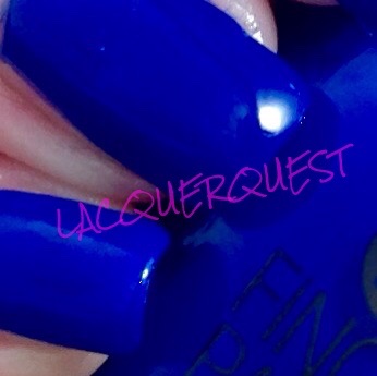
I’m not sure how to describe the consistency.  It was substantial, but not thick.  Sort of like that cheap ass Jiffy frosting you make yourself v. the expensive Duncan Hines stuff already mixed in the can.  I think the texture of it even affected the look of the creme.  All shiny and luxurious but solid, like latex.  Latex?

I’m not talking latex wall paint, but latex like in superhero catsuits.  In fact, that’s it!  The color, finish, shade, depth, it reminds me of Mystique’s skin.  Not that lame ass J-Law body suit in Days of Future Past, but pure old-school kick ass Romjin rubber and body paint.  Don’t get me wrong, I loved Days of Future Past!  I think it rivaled Last Stand for the best installment in the whole series.  It was even better than First Class and that insane Kevin Bacon/Michael Fassbender action was everything!

So why did J-Law wuss out and request the body suit in the first place?  Word on the street is that she found the prosthetics and body makeup and whatnot that she wore in First Class was just too uncomfortable.  Sack up, Lawrence!!  What about dedication to your craft?  What about suffering for your art?  For Magneto’s sake, take a cue from ScarJo, who rocked the Black Widow leather while she was pregnant, dammit!  Now that girl is FIERCE!!

Can you tell I’m jazzed about Avengers 2:  Age of Ultron coming out this Friday?  I usually give it a while for the crowds to thin out a bit, but I’m not sure I can stand it this time.  It’s a distinct possibility that I will end up with tickets to the gun show this weekend.  I’m even thinking of springing for the IMAX, if you can believe it….

Where was I now?  Oh, yeah, nail polish!  I really love Magritte’s Masterpiece.  Way to go, FingerPaints for making my dreams come true!  Now if only Hawkeye can do the same.  SPOILER ALERT:  He probably can….

Advertisement

A Few Words on … BOGOs

My mother relies on my sister and me for all of her transportation needs which, of course, includes her grocery shopping.  So we have a deal worked out that whichever one of us takes her gets Savings Catcher rights to her receipt.  My mom is a Catcher’s jackpot!  She buys brand names, does no price comparison and pays absolutely no attention to sales.  While reviewing my savings balance, I’ve noticed that I almost always get double because she buys two of everything.  So what does that have to do with nail lacquer?  Is the Quest turning into a multi-purpose personal blog?  Yeah, like I have anything interesting to say about a variety of topics, or even on the general condition of the human race….

So, again, what does this have to do with nail lacquer?  Read on, Macduff!

I, as opposed to my mother, live for store brands and sales!  But in thinking about it, I realize that I have inherited her habit of buying two of something.  Of course, in my case, I buy two of something if it’s on sale.  And BOGOs?  They get me weak in the knees and send me into a spiritual awakening….

For those uninitiated in the jargon of cheap bastardity, BOGO stands for Buy One, Get One (the free is implied).  I’ve mentioned the joys of BOGO in the past, along with my recent disappointment over no BOGOs at Ulta for their spring Beauty Steals.  But wait, didn’t I say that I didn’t really have any butterLONDON wants at the moment?  Yes, it was a mild disappointment, but still disappointing because I get excited over BOGOs whether I actually want it or not!

So you know where this is going, right?

Uh huh.  The day after Ulta’s BL steal, I get an email from Sally that they’re having a three day BOGO sale on all nail polish!  Except for OPI, of course.  It’s always excluded from super deals just about everywhere.  I’m not sure if the gels were included this time, sometimes they are, sometimes not.  I don’t really pay attention because I don’t use gels.  I have been using the foundation and top and curing them for a clear base under my regular manicures, but I don’t need colors for something that’s supposed to last 2-3 weeks when I get sick of my current color anywhere from 3 days to 5 minutes after I complete it.  Not to mention that it’s time consuming and labor intensive as hell to remove.  But that’s another topic for another Few Words….

Thing is, I try like hell not to go to any stores on the weekend.  Not only do I hate people aimlessly milling about, and crowded parking lots, and standing on lines at the register, Sally in general and my Sally in particular are tiny little cubbies with aisles like rabbit warrens.  And I like to take my leisurely damned time aimlessly milling about while perusing both the regular lacquer display as well as the clearance racks (which are located in various dark, crowded corners of the store).  And, I didn’t have a lot of interest, as I haven’t even paid much attention to the spring lines for China Glaze, FingerPaints or Orly (the only three at Sally that I consider other than OPI).  However, last time I was there they had a whole slug of China Glaze in the clearance rack that hadn’t yet been marked down and I had my reward coupon for March burning a hole in…..well, burning a hole in the passenger seat of my truck.  What, everybody doesn’t toss any possible coupon or deal circular directly into their vehicle?  You never know when you might be innocently tooling about on the streets when a sale breaks out!

So, I made a deal with myself that if I happened to get my lazy bahonka out of the house on Friday, I’d go check it out.  And, true to form, I only made it outside to check the mailbox.  Crisis averted!  But I wasn’t quite out of the woods just yet….

Now, the one exception to no weekend shopping is early Sunday morning.  I stay with my mother on Saturday nights and if I leave her house early enough on Sunday mornings while the faithful are in church and the sinners are sleeping it off, I’ll do store errands.  Best time hands down for Costco is when they open on Sunday.  Well, my brother was in time visiting so we went out to breakfast and all that family happy times stuff so I went straight home when I left shortly after noon.  Okay, crisis really averted!  As it turns out, not so much….

Since I didn’t go to sleep until 5 am (because I’m wild like that) and got woken up at the crack of 7:30 to go to breakfast, I went home and settled in for a little nap.  Aren’t Sunday afternoon naps the best?  So I woke up around 3, puttered around a little and suddenly got THE URGE to go check out Sally BOGO and clearance polish right damned NOW!!

What could I do?  Well, what any reasonable person would do.  I threw on some sweats, piled the bed head up into a hair claw and hit the road!

Well I get to Sally, hit the clearance rack and find out that all the China Glaze has been snagged.  Dammit, if only I would have gotten there before the sale started and the vultures descended, I might have been able to score some of the ones I was scouting.  (BOGO was a limit of three, so that gets saved for the full price stuff.)

So, eh…. I did manage to find two FingerPaints on clearance that I found acceptable.  Nothing completely spectacular, but at $2.29 worth the chance.  And really, the only full price polish I’ve had on my Get When on Sale List was China Glaze Dorothy Who? so maybe I’ll forgo the BOGOs this time…..

(insert maniacal laughter)

image

For those keeping score (like I supposedly do), that’s 2 China Glaze (the aforementioned Dorothy and Deviantly Daring, a duochrome I’ve looked at a few times), 2 Orly (I’m still mad about missing out on Mirrorball in their holiday collection) and 4 FingerPaint (2 on clearance).

So, after the BOGOs, the clearance, my Sally Club discount and my % off coupon, I got 8 bottle of nail lacquer for well under $3.00 each.  And I’ve already used one of them that ended up being something perfect that I’ve been looking for a long time now and nothing I get has been exactly right.

Sneak peek!

image

So job well done, right?  Yeah, I’ll just keep telling myself that….

Zoya – Blu

Blu was part of Zoya’s Spring 2013 collection called Lovely.  They really go for the pastels in their spring lines and that year was no exception.  As I remember, they had three cremes and three shimmers.  Not surprisingly, I preferred the cremes!  I think I got two of them and I really liked the third, Neely, but I already had at least three likely dupes, so I abstained.  I don’t know how many times I picked that up at Ulta and then remembered, “oh, yeah, I like this so much I already have half a dozen similar polishes”…ha!  I also have one of the shimmers (Piaf), but just because I got it on clearance and it was a vastly under-represented color in my collection.

So, Blu….  Surprisingly, it’s blue!  A gorgeous, light baby blue, even an exceptionally pale sky blue.  After the disappointment that was Avery, I felt it necessary to follow up with this one just to restore Zoya’s good reputation for killer cremes!  I think this picture is showing a bit lighter than it is in real life.

Blu


Now that my nails are starting to get back in form, looking at these older pictures is cringe-inducing!  But be stout of heart and hang in there because, as we’re so often told, it really does get better.  I also have a new cuticle regimen so those ragged polish lines have improved as well.

But, back to Blu.  For a light colored creme, this is an exceptional polish!  This is three coats, but I really do think I could have gotten by with two.  Just a few streaks on the first coat and, rather than it being too thin or chalky, it was on the thicker side. Not enough to be goopy, but enough to have really good control and fantastic leveling.

I liked it so much that I wore it for probably a week (which is unusual for me) and I freshened it up for a few days with a coat of OPI’s Last Friday Night from their Katy Perry Holiday Collection way back in 2010.  Yeah, it was a little bit beyond being capable of freshening….

Blu Friday Night


This is kind of a blue and pink-iridescent glitter in what I thought was a clear base.  But it does look like it darkened up the Blu a little bit (also this picture is truer than the previous one), so I think it might be a lightly tinted blue base.  I’ll have to delve into this more deeply when Last Friday Night gets its own review, but when I’ve used it by itself I haven’t seen any color change on the nail besides the glitter.  As you can see it’s more suitable as an overcoat, although I don’t recall it being marketed as such.

OPI – I Have a Herring Problem

The two big deal OPI collections are the geographically themed ones for spring and fall (that actually come out a couple of months prior to the start of the season).   They have other collections they do every year, most notably the holiday and summer collections.  These have varying themes, most often a movie tie-in or a celebrity (their most recent celebrity is Gwen Stefani), but the spring/fall big guns are always centered around a geographical region.  Probably some of the hype over these is created by speculating on what city/state/country/region will be next.

The last couple years these collection have been a little hit or miss, but back in 2012 they were still going strong and the spring Holland collection was no exception.  There might have been a slight clunker or two, but no real flops and the collection as a whole was fabulous.  I probably have close to half a dozen of the Holland polishes and this is one of my favorites from that group.  I really don’t wear it that often, although I don’t know why.  That’s one of the fun parts of the Quest, discovering some real gems that I’d forgotten I even had!

I Have a Herring Problem is a medium, dusty blue with an understated shimmer of gold and silver.  Although it’s not even slightly teal, the blue leans green as opposed to gray (more on this in the following paragraph).  It’s a very wearable color, as the blue is about as close to neutral as blue can get and the shimmer is just a hint, rather than screaming GLITTER!!!!1  It was a bit on the thick side, but I think that was just due to the shimmer packed in there rather than it just being a straight creme.

Herring1


I really biffed the little finger on this hand, but I’m showing it anyway as you can see the shimmer a little better:

Herring

There is another shade in this collection called I Don’t Give a Rotterdam that, on first glance, looks just like Herring Problem.  I ordered them online and couldn’t decide between the two, so I got both (of course!). It’s funny, when you hold the bottles in separate hands they look identical, but when you put them together…

Herring Rotterdam

That’s Herring on the left and Rotterdam on the right.  See what I meant about the green in Herring?  You don’t even notice it until you hold it next to the slate blue Rotterdam.  In fact, I would have described Herring as slate blue before I compared the two side by side.  I think that Rotterdam also just has silver shimmer with no gold, but I can’t tell for sure until I actually brush it out.  When I do the Rotterdam manicure I’ll try to remember to use Herring as an accent nail in order to have a side by side comparison on the nails.

Here’s something else strange about these two; when I was looking for Rotterdam in order to compare, I couldn’t find it.  The label with the name has fallen off of the bottle and I kept picking it up and saying “no, that’s a gray shimmer”.  After I’d gone through the entire box of OPI I broke out the swatch sticks, compared and, sure enough, that “gray” was Rotterdam!  It didn’t look blue until I held it next to Herring.  Colors (and our perception of them) are weird….


Nail Art – Little Mermaid Party

This really isn’t nail “art”, but it best fits this category because it isn’t a review and the manicure was put together for a specific look and occasion.

The occasion was my niece’s first birthday party and it had a Little Mermaid theme.  I could have gone all fancy with iridescent fish scales and some black outlines, but I didn’t actually do it until the night before.  So the plan was to use the Mermaid colors of purple and teal with some of the same colored glitter and sparkles on top.  But did I have four different lacquers in the appropriate colors that would work together?  What a silly question….

Mermaid teal

Mermaid Belinda payton


The base color for the right hand was OPI’s Ski Teal We Drop, a dark teal creme from the Fall 2010 Swiss Collection topped with Art You Wondering, a turquoise/teal micro glitter in a clear base from FingerPaints.  This was also the accent nail on the left hand.

The left hand was two colors from the Zoya 2013 Zenith Holiday Collection.  The base was Belinda, a dark purple metallic while the topper was Payton, a jelly with a slight holo that was more of a violet purple.  The accent nail was teal, to match the other hand.

I really like how it turned out, so much so that I might use the same colors for a straight on manicure.  But I’m still going to get more advance notice for this year’s theme so I can top this one!


OPI – Can’t Find My Czechbook

This was part of the Spring 2013 Euro Centrale Collection.  I think I “only” got four from that collection and three of them (not sure about the fourth) were added to the permanent line.  Does that mean that I have good taste or I’m just pedestrian and part of the crowd?  I’m going with the former…

Can’t Find My Czechbook (har, har) is perfect in every way!  It’s got the exceptional formula that most of the OPI cremes have and could probably be a one coater.  Plus it’s a deep turquoise blue that doesn’t have any green in it.  That might sound weird, but most really blue turquoise is kind of washed out and this has a beautiful pigmentation.

I want to call it robin’s egg blue, but I think it might be a bit deeper than that.  Or maybe sky blue? Or a darker Tiffany blue? I don’t know.  What I do know is that I’m not very fond of the color blue, outside of some very specific shades, and this is one of them.  It’s smooth and clear and just… well, just perfect!

image

image


China Glaze – Turned Up Turquoise

Turned Up Turquoise was introduced as part of China Glaze’s Ink Collection from the summer of 2008, but is now part of the permanent line.  The collection was somehow related to tattoos, although any connection to either the colors or the names is beyond me.

I really want to love China Glaze, I’ve tried to convince myself to love it, I’ve kept buying it to try and force myself to love it.  It has a cool name, scads of colors, is priced on the lower end of the salon brands and is readily available at Sally Beauty Supply, which is my favorite beauty store and just down the street from me.

I don’t love China Glaze.  I like it, but I don’t love it.  There are a couple of them that I love, For Audrey and Make a Spectacle, for example.  But the rest of it is kind of take it or leave it.  Now that OPI has finally agreed to let Sally carry their line, my consumption of China Glaze will tail off dramatically.

The only reason I got this one was because it was in an ombre set of four colors called Wait Teal You See that was at a great price.  I think this was some time last summer and, while I wouldn’t have gotten it separately, I like it enough that I’ve worn it maybe two or three times since then.

This is kind of a strange one.  It’s marketed as a neon and, while it’s certainly bright, it doesn’t have that vibrant, knock you out punch that I associate with neons.  However, like most neons, it does dry matte.  It looks so different that I took pictures before and after top coating.

image

This photo was taken after three coats of polish.  Mattes tend to dry super fast and this one is no exception.  But then give it a little Seche Vite magic and…

image

Voila, it’s now a sleek and glossy sight to behold!  By the way, for those who have been wondering what in the world is this Seche Vite I keep carrying on about and what’s the big deal anyway, I’ll be devoting an entire post to this miracle in a bottle in a few days.

While the color in the pictures is lovely, it’s not accurate at all.  TUT is actually a green turquoise and skews heavily to the green side of green-blue.  This is apparently a common problem with this polish as I’ve looked at other pictures of it on the internet and far better photographers than I get the same blue and comment on it.

There used to be a toothpaste that was a green gel with a bluish tinge, but I can’t remember the name. Gleem, maybe?  The next best comparison I can think of is to take regular Scope and toss in a dash of the Blue Mint Scope and there you are!

The first coat, and maybe even the second were pretty streaky, which is common with neons, but they dried so fast it waa no real hardship.  I remember the third coat being thick and giving me a few globs, but I don’t see them on that first picture, so they might have been on my left hand.  It all got sorted with the top coat, but if you like rocking the matte look, be careful to make sure that last coat isn’t too lumpy.