OPI – Hey Baby

Companies like celebrity spokespersons and lacquer companies are no different.  But they usually end up confusing me.  Sure, sometimes they hit the nail (ha!) on the head, Wet n’ Wild’s Fergie collection is sparkly and cheap, not unlike Fergie herself.  The many Kardashian Kollections from Nicole by OPI?  Company’s second tier, less expensive product in goofy shaped bottles and geared toward teenagers and mainly available in supermarkets.

But these tend to be the exceptions.  NOPI had a Justin Bieber collection.  What?  How much varnish does the Biebs go through on the daily?  Probably not much, but I would assume those little Beliebers go through quite a bit.  Oh, geared toward teenagers and purchased at the supermarket.  I guess that one makes sense, too.

Aside Alert:  I’ve recently been informed that people like lots of pictures to interperse the walls of text on a blog post.  While I’m mostly a purist who only adds pictures that are relevant to the topic at hand, when in Rome….

Enjoy this cute picture of a kitten who may or may not be named Gwen... but who certainly looks like the type of gal who would enjoy OPI Hey Baby.

Enjoy this cute picture of a kitten who may or may not be named Gwen… but who certainly looks like the type of gal who would enjoy OPI Hey Baby.

But let’s take a look at a more top-drawer brand.  In recent memory OPI has had collections from Katy Perry, Nicki Minaj, Mariah Carey and Gwen Stefani.  I think that all of them, with the exception of the Carey and Stefani holiday collections, have had the polishes named after songs of the corresponding artist.  But the songs generally have nothing to do with the colors.  For instance, Mariah Carey’s were almost completely dull, boring granny shades.  Well, okay, maybe they didn’t fit the songs, but I guess they kinda fit the inspiration.

Then there’s Gwen.  And a lot of those made sense.  Obviously they had a clear, bright red called Over and Over A-Gwen (oh OPI you corny thing, never change!).  It might have even been my elusive, perfect red but it was a “special” addition that came with nail art and studs and a bunch of stuff that I didn’t feel like paying $15 for when I have approximately 48509433 other reds already.  The satin black shade? Four in the Morning.  Love Angel Music Baby, sparkly gold. See?  Those make sense!

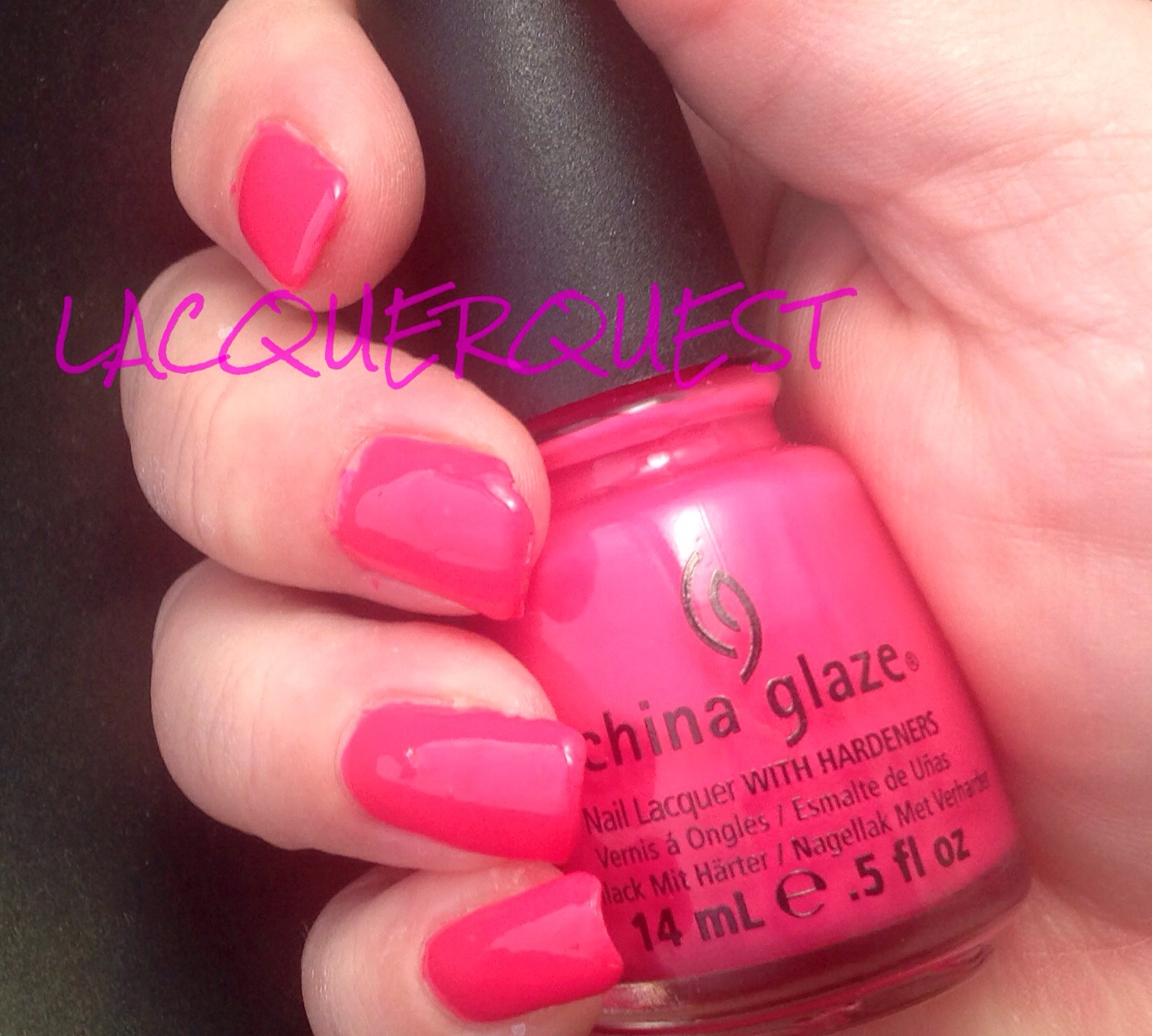
Which brings us to Hey Baby.

Hey Baby

There’s really not a whole lot to say about this other than it’s pretty much perfect as far as its intended purpose.  Sure, there aren’t a lot of bells and/or whistles and it isn’t an incredible Holy Grail color.  Let’s face it, there are probably more shades of pink nail lacquer to choose from than any other color.  Whatever shade you’re looking for, chances are you’ll find several options without even trying too hard.

So, let’s go under the premise that we’re looking for a specific shade of pink in a creme nail varnish.  More subdued than a bubblegum, but still bold.  Nothing muted or dusty.  Darker than baby pink, but definitely an undeniable pink.  No mauves, soft reds or dark roses.

Now that we’ve narrowed down color, it must be a good creme nail varnish.  Not the slightest hint of shimmer or frost, but highly pigmented with enough depth to not be even close to a matte.  It must apply smoothly, cover easily and level flawlessly.  Above all, it must look clean, shiny and glossy enough that three days in you can still quickly glance at your nails and, for just a split second, think they’re still wet.

Which, once again, brings us to Hey Baby.

OPI Hey Baby

The color is showing more red on the nail than in person.  The bottle color is more accurate with the pink being a bit clearer even than that.

All you expect from a good OPI creme polish.  Great color, great formula, great wear.  Thanks, Gwen!

Advertisement

China Glaze – Grape Pop

Although I don’t always go in order of being used, I think that the pale green pastel is next chronologically.  But I took some comparison pictures with a couple of other colors that I want to include in the review and I haven’t uploaded them to WP yet.  So I’ll forge ahead and let something else take cutsies….

Grape Pop was in the China Glaze’s Spring 2010 collection called Up & Away.  It was mostly straight cremes of various candy shades.  I don’t know what that has to do with hot air balloons, but I do have a few from that collection and it was a pretty nice group.

This is a straight ahead purple creme.  If I had to pick, I’d say it leans blue rather than red, but it’s pretty much right down the middle.  While that might sound a little boring, it’s actually really great!

image

See?  It’s vibrant without being flashy, highly pigmented without being dark and one of the best creme formulas from China Glaze that I’ve come across.  See that beautiful coverage?  TWO coats!  That’s it!  Even me, the Original Three Coat Queen, looked at it after two and thought, “eh, there’s absolutely nothing here that could be improved by another coat”.

And while the color seems like something that I have at least a dozen similar shades, not really.  I’ll have to dig through because the few I compared just by bottle were quite different.  I have one Sally Hansen CSM (Good to Grape, maybe?) that I think might be close.  When I find it, I’ll compare.

If you want a candy coated purple that’s not too dark, not too light, that’s a straight creme with no shimmer, glitter or fleck of any kind, covers well and goes on like a dream, Grape Pop is an excellent choice!


Zoya – Blu

Blu was part of Zoya’s Spring 2013 collection called Lovely.  They really go for the pastels in their spring lines and that year was no exception.  As I remember, they had three cremes and three shimmers.  Not surprisingly, I preferred the cremes!  I think I got two of them and I really liked the third, Neely, but I already had at least three likely dupes, so I abstained.  I don’t know how many times I picked that up at Ulta and then remembered, “oh, yeah, I like this so much I already have half a dozen similar polishes”…ha!  I also have one of the shimmers (Piaf), but just because I got it on clearance and it was a vastly under-represented color in my collection.

So, Blu….  Surprisingly, it’s blue!  A gorgeous, light baby blue, even an exceptionally pale sky blue.  After the disappointment that was Avery, I felt it necessary to follow up with this one just to restore Zoya’s good reputation for killer cremes!  I think this picture is showing a bit lighter than it is in real life.

Blu


Now that my nails are starting to get back in form, looking at these older pictures is cringe-inducing!  But be stout of heart and hang in there because, as we’re so often told, it really does get better.  I also have a new cuticle regimen so those ragged polish lines have improved as well.

But, back to Blu.  For a light colored creme, this is an exceptional polish!  This is three coats, but I really do think I could have gotten by with two.  Just a few streaks on the first coat and, rather than it being too thin or chalky, it was on the thicker side. Not enough to be goopy, but enough to have really good control and fantastic leveling.

I liked it so much that I wore it for probably a week (which is unusual for me) and I freshened it up for a few days with a coat of OPI’s Last Friday Night from their Katy Perry Holiday Collection way back in 2010.  Yeah, it was a little bit beyond being capable of freshening….

Blu Friday Night


This is kind of a blue and pink-iridescent glitter in what I thought was a clear base.  But it does look like it darkened up the Blu a little bit (also this picture is truer than the previous one), so I think it might be a lightly tinted blue base.  I’ll have to delve into this more deeply when Last Friday Night gets its own review, but when I’ve used it by itself I haven’t seen any color change on the nail besides the glitter.  As you can see it’s more suitable as an overcoat, although I don’t recall it being marketed as such.

Zoya – Avery

Sigh… I’ve been dragging my feet on this one and putting it off because it pains me to do it.  So let’s rip off that band-aid and just get it over with, shall we?

Avery was introduced in Zoya’s Winter 2011 collection called Feel and is now part of the permanent line.  It was soft pastel cremes, which would seem more spring to me, but that might just be because OPI brings out their Soft Shades in spring and I’m used to that.

Avery is a nude yellow-toned beige.  I seemed to recall that I didn’t like this polish for some reason, but couldn’t remember exactly why.  It wasn’t the color because I like the color (even though I usually prefer a pink or grey toned beige).  I like it so much that I sort of bought it twice.  I think it’s a straight on dupe for OPI’s Don’t Pretzel My Buttons from the Germany collection.  I can’t compare because they looked just alike so I gave away the OPI.  Why?  Because Zoya and OPI both do great cremes and I liked the name of the Zoya better.  Bad move, as it turned out…

So what’s the problem?  You’re about to see it.  If you have pearls, be prepared to clutch them:

Avery

It’s the lumpiest, gunkiest, grossest polish I’ve ever seen from Zoya.  And it’s even more egregious coming from them, because they’re usually so good!  I expect crap like this from cheap dollar polish from the drugtore, but Zoya??  Come on!  I don’t think it’s even necessarily the Feel collection itself because I have at least one other polish from that collection (Kennedy) and I have no problems with that one.

I even used this in a manicure a few months ago, but it came out so crappy that I thought it might be operator error and deleted the pictures and put it back in the To Be Tried.  So, when I recently did the right hand with China Glaze Angel’s Breath and it turned out horrible, I decided to just go ahead and do the other hand with Avery because it was no big deal if it came out bad because I was going to re-do my right hand, anyway.  And, as you can see, bad it did come out….

But wait!, you might say, this could have been operator error as well.  Perhaps your nails weren’t smooth and clean.  Perhaps your base coat was bad.  Perhaps you were tired by the time you got done with the travesty on the other hand and just didn’t do a good job of it.  Perhaps there was a full moon combined with a neap tide and the barometric pressure was dropping at the same time.  Yes, you might say that.  But I would counter with, “oh contraire, mon frere!”.  Here is the same hand right after I finished the manicure that immediately followed the removal of the Avery’s Angel Breath mess.  A manicure accomplished with a finicky white-based pastel, I might add.  Observe…

(Bonus sneak peek at an upcoming review manicure!)

Ggreen


Sorry, Avery, you’re going in the sad face column and are a prime candidate to be Wallflower of the Year.  Oh, who am I kidding, I’ll try it at least once more (probably after the next epic nail breakage) just to make sure.  Because you are Zoya, after all…..

China Glaze – Angel’s Breath

Angel’s Breath was a polish that China Glaze put out a few years back in a Breast Cancer Awareness collection, but is now part of the permanent line.  It’s a very sheer white with a slight hint of pink to it.  The only reason I have it is because it was part of a gradient set I picked up about two years ago.  Although it’s not anything I would have purchased on its own I do have a few sheers, including a couple pinkish ones, so  I’m not opposed to the color itself.  It’s just not anything special that would catch my eye and tell me that I must have it.

All of that to say as a disclaimer of sorts that I wasn’t prejudiced against this one before I even tried it.  In fact, since my nails are in the awkward stage I was looking forward to a soft shade and wasn’t even opposed to a little VNL in the process.   What I wasn’t looking forward to was four (!) coats of runny, cuticle flooding, streaky mess that left both bald spots and globs at the same time.  And, although it doesn’t really show in the picture, the VNL was still really prominent after all those coats.  There’s not a top coat on it because I could not get this mess off fast enough, so I didn’t even do both hands.

Even this Queen of Rationalization on why to keep something can’t recommend it as an undercoat, because the number of coats (four!) to even get a semblance of smoothness is way too many when you haven’t even added your main color or topcoat, or for a french, because after all those coats (four!) it’s not sheer enough for the nail color and not opaque enough for the tip color.

Angels Breath


But, wait! (you might say), the picture doesn’t look all that bad…  If you have the intestinal fortitude to zoom the picture, you’ll see the blobs, the patchiness, the raggedy cuticle line and and the complete non-leveling action, even after (did I mention?) four (!) coats.  I suppose it could have evened and smoothed out at some point, I just gave up after four.  Go ahead, zoom in, just don’t say I didn’t warn you…

butterLONDON – Queen Vic

I have a somewhat rocky relationship with Butter London, which I expounded in a somewhat blistering fashion in a previous BL review.  But I’ve been on a bit of a BL spree in the last several months, what with BOGOs at Ulta and 50% coupons off of already reduced last orders on their website.  In spite of myself, I’ve begun to love it.  I still don’t love it $15 for 11ml worth, but I really love it at $8.00 and under…

This is Queen Vic, which BL calls a red wine/cranberry creme.  I only had a few BL cremes in my collection previously, but I’ve gotten quite a few more with my latest acquisitions.  For the most part I’ve liked them, I find them better than China Glaze, but not quite up to OPI standards.  I’d put them just under Zoya, which might be attributed to the brush.

Queen vic1

I’d classify this more as a berry than a cranberry, which I think of as more red.  Maybe red wine/dark mauve as it does lean just a taste purple.  I find it very close to OPI Anti-Bleak from their one of of their Mariah Carey offerings a few years ago or Casino Royale from the Skyfall collection.  Also Got Cherried Away from the Coca-Cola collection, which I actually have.  I’ll need to remember to do a comparison when I get around to reviewing that one.  Or maybe Zoya’s Veronica.

In other words, there’s nothing unique or special about the color.  Well, I shouldn’t say not special, because the color itself is a great one.  Probably why there are so many variants of the shade available.  Work appropriate but not boring, understated but not granny-ish, attractive on just about every skin tone and any nail length.  In other words, a pretty classic shade and one that I’m quite fond of in general, not just in nail varnish.


China Glaze – Escaping Reality

I think this might be the last one from my “old” batch of pictures before I cut all my nails down and went on hiatus.  But never fear, I’ve been busy making new ones!

Remember that movie Cirque du Soleil: Worlds Away that came out around Christmas of 2012?  Yeah, me neither.  But China Glaze apparently thought so highly of it that they did an entire full size collection devoted to it as a tie in.  Remember that 2012 holiday collection from China Glaze called Cirque du Soleil:  Worlds Away?  I do, but just barely and vaguely at that….

But, after brushing up on it in preparation for this post, it did have a couple of cool glitters that I liked.  But I find it physically impossible to pay full price for China Glaze (as reasonable as it is for a salon brand) and there were only a handful of cremes left when Sally finally got around to clearancing them.  So I ended up with two of them, a coral whose name escapes (ha!) me right now and this one.

Escaping Reality is a hot pink that borders on neon.  If it was a brighter or lighter shade it could very well go neon or fluorescent, but the pink is a darker blue leaning shade that saves it from being too loud and makes it much more wearable, rather than just being a “just for fun” choice.  I still classify it as a “hot” pink because it’s highly pigmented, plenty bright and not at all soft.

China Glaze Escaping Reality

As far as the formula goes, it was a bit on the runny side for a creme but I didn’t have a problem with any cuticle flooding.  It wasn’t even necessarily that patchy but since I like to do three coats anyway, that doesn’t really work against a polish for me.  Unless it’s one of those that you’ve still trying to even out half a dozen coats into the thing!  While it wasn’t exactly a matte, there wasn’t much shine to it, but a coating of my precious Seche Vite fixed that up and left my nails looking creamy smooth and ultra shiny.

I also added an atrocious attempt at some tiger stripes at some point before I removed it.

China Glaze Fingerpaints Charcoal

Although I’m far from the best nail artist in the world, I can usually do a pretty decent animal print, so I don’t know why this is 1.  so amateurish and 2.  why I took a picture of it.  Since I’m holding a FingerPaints striper in the picture, I’m pretty sure that I’d just gotten the stripers and….. wait!  I do remember!  Sally was having a B2G1 sale on FingerPaints stripers and I got those at the same time as the two China Glaze polishes!  Since it was the first time I’d gotten the FingerPaints brand of stripers I was testing one out while sitting on the couch with just a shaded lamp for a light source while chatting away with my sister.  Now that I remember the circumstance, that striping job turned out pretty well!

The striper was Ch-art-coal Black and is a really nice one.  Granted, my only other stripers are Salon Perfects that sell for a buck or two at the drug store but FingerPaints are definitely my favorites.  The brush is very narrow, but really long with flexible bristles and a nice point so you can get really thin lines as easily as thicker ones.  The polish itself is thin enough for a light touch and good control, but not so runny that it will drip and spread.  It’s pretty much like a nice fluid eyeliner, it goes where you put it and not where you don’t.

Nail Art – Little Mermaid Party

This really isn’t nail “art”, but it best fits this category because it isn’t a review and the manicure was put together for a specific look and occasion.

The occasion was my niece’s first birthday party and it had a Little Mermaid theme.  I could have gone all fancy with iridescent fish scales and some black outlines, but I didn’t actually do it until the night before.  So the plan was to use the Mermaid colors of purple and teal with some of the same colored glitter and sparkles on top.  But did I have four different lacquers in the appropriate colors that would work together?  What a silly question….

Mermaid teal

Mermaid Belinda payton


The base color for the right hand was OPI’s Ski Teal We Drop, a dark teal creme from the Fall 2010 Swiss Collection topped with Art You Wondering, a turquoise/teal micro glitter in a clear base from FingerPaints.  This was also the accent nail on the left hand.

The left hand was two colors from the Zoya 2013 Zenith Holiday Collection.  The base was Belinda, a dark purple metallic while the topper was Payton, a jelly with a slight holo that was more of a violet purple.  The accent nail was teal, to match the other hand.

I really like how it turned out, so much so that I might use the same colors for a straight on manicure.  But I’m still going to get more advance notice for this year’s theme so I can top this one!


OPI – Big Apple Red

Big Apple Red made its debut in the New York Collection way back in 2000 and has since become a classic in the line.  It’s easy to see why, it’s a classic middle of the road red, nice opacity and shine and, of course that famous OPI smooth as a dream creme formula.

But it enough?  I don’t know.  I’m on a perpetual search for The Perfect Red.  Although red is one of my favorite colors, I don’t really wear a lot of red polish.  I think it’s because for so long there weren’t many options in nail varnish and red was pretty much the default go-to.  Plus I can’t wear red unless my nails are fairly long because short, stubby nails + short, stubby fingers + red polish = man hands.

So, while Big Apple Red was the closest for quite some while to my dream red, it wasn’t quite there.  And I only have it in a mini because I couldn’t quite commit to a full size bottle of a color I don’t wear that much when the search was still on.  That’s also why the bottle shot shows Seche Vite instead.  The mini is too small to really show but a bottle is something to hang onto so you don’t relapse into Claw Hand.

OPI Big Apple Red

As you can see, this was one of the 70% of times that I forget to wrap the edges.  Pro-tip:  If you’re wearing red, make a real effort to remember to make it the 30% that you remember to wrap because it’s a lot more noticeable than with a lighter color!

What keeps this from being The One?  It’s a nice clear, true red but I think it leans just a skosh blue.  And, while I’ll take a red that leans blue over a red that leans orange every day and twice on Sunday, it’s not The Perfect Red.  I’d also like it to be just a tad more squishy, like a crelly rather than a straight creme.  But, it’s shiny glossy and fabulous so I highly recommend it for someone that isn’t as picky as me.

I’ve since gotten a couple of candidates that just might be The Perfect Red, but I need to compare them head to head.  I think at some point I’ll do an entire post consisting of the Tournament of the Reds.  I’ll need to wait a bit longer until my nails grow out a little more so I can go all Dragon Lady Style with it and quite possibly crown an Ultimate Grand Supreme Empress of the Reds!


China Glaze – Sweet Hook

This color was first introduced in the Spring 2012 Electropop collection.  With a name like that you’d think bright, flourescent, maybe even neon, but  the majority of that collection was pastel creme and we will be re-visiting Electropop a few times during this journey, since I’ve got several of those cremes.

I was fairly certain that this was now in the permanent line.  I looked it up to make sure and, unless they’ve changed this color with it went stock, the shade that China Glaze shows for this one is really off.  It’s showing a medium-dark lavender and the original is a light, pink leaning lilac.

I’ve got a couple of really rough looking spots on this one (did I not even look at these before I uploaded them?), but the color does show true, so I’m going with it.  Just imagine that index nail had a meteorite fall on it just before the picture was taken.

China Glaze Sweet Hook

This shows my why (as I’ve mentioned before) I’m sort of meh on China Glaze.  Nice color but nothing spectacular.  Not a great formula, but not really awful.  And that’s pretty much China Glaze.  Not bad enough to avoid it like the plague, but not good enough to seek it out and reach for it over something else.  I’m probably somewhat spoiled, as I have a lot of OPI and Zoya, who are masters of creme formulas and colors.

But Sweet Hook does have something that makes it one of my favorites and has me overlook the formula being a bit thick.  This is one of the most complimented shades I wear, especially from the men.  You’d think they’d go for the sexy, vampy stuff, right?  Whether it’s just the shade itself or it just looks good with my skin tone, there’s something about this otherwise innocuous nail polish that makes people notice it and remark.  And, hey, who doesn’t like a little positive reinforcement when it comes to their manicure?