butterLONDON – West End Wonderland

Well, well, well…here we are again.  Oh, Butter London, I just can’t quit you…  I’m going to keep using you until I love you, dammit!  Truthfully, I’m almost there, at $8.00 or less, anyway.  I got this one in a Holiday two-pack that was half off the regular price and then I got 50% off of that.  Butter London at $3.75 a bottle?  Yes, please!

West End Wonderland is a light gold glitter in a clear base.  I’m not really a fan of gold in general and gold nail lacquer even less.  But this always looks so tempting that it’s been on my “maybe” list for several years.  When the aforementioned deal came up (the other one in the pack was Come to Bed Red, which is another one that’s been on that list for a while). I finally took the plunge.

And I’m glad I did.  It looks pretty dark on the BL site, but in person it’s much lighter and brighter and even has a sprinkling of sparkly copper and pink!

West end wonderland


Here’s another shot to show how delicate it looks when it’s in the light:

West end wonderland1

Like most clear glitters, it goes on quite sheer.  In fact, I think that a light coat of this would be a great topper to a creme underneath.  Unlike a lot of clear glitters, it was perfectly opaque after three coats. It also came off really easy, not just swipe, wipe like with a creme, but it didn’t require soaking, either.  Also like most glitters, it wasn’t perfectly smooth but just one coat of Seche Vite fixed it up nicely and, since I always finish with the SV, it wasn’t even an extra step.

Will I wear this all the time?  No, because even though it exceeded my expectations I’m still not a real fan of gold glitter.  Will I wear it again?  Yes, it’s easy to apply and easy to remove.  I might even try it as a topper for some sort of holiday manicure come December.

OPI – I Have a Herring Problem

The two big deal OPI collections are the geographically themed ones for spring and fall (that actually come out a couple of months prior to the start of the season).   They have other collections they do every year, most notably the holiday and summer collections.  These have varying themes, most often a movie tie-in or a celebrity (their most recent celebrity is Gwen Stefani), but the spring/fall big guns are always centered around a geographical region.  Probably some of the hype over these is created by speculating on what city/state/country/region will be next.

The last couple years these collection have been a little hit or miss, but back in 2012 they were still going strong and the spring Holland collection was no exception.  There might have been a slight clunker or two, but no real flops and the collection as a whole was fabulous.  I probably have close to half a dozen of the Holland polishes and this is one of my favorites from that group.  I really don’t wear it that often, although I don’t know why.  That’s one of the fun parts of the Quest, discovering some real gems that I’d forgotten I even had!

I Have a Herring Problem is a medium, dusty blue with an understated shimmer of gold and silver.  Although it’s not even slightly teal, the blue leans green as opposed to gray (more on this in the following paragraph).  It’s a very wearable color, as the blue is about as close to neutral as blue can get and the shimmer is just a hint, rather than screaming GLITTER!!!!1  It was a bit on the thick side, but I think that was just due to the shimmer packed in there rather than it just being a straight creme.

Herring1


I really biffed the little finger on this hand, but I’m showing it anyway as you can see the shimmer a little better:

Herring

There is another shade in this collection called I Don’t Give a Rotterdam that, on first glance, looks just like Herring Problem.  I ordered them online and couldn’t decide between the two, so I got both (of course!). It’s funny, when you hold the bottles in separate hands they look identical, but when you put them together…

Herring Rotterdam

That’s Herring on the left and Rotterdam on the right.  See what I meant about the green in Herring?  You don’t even notice it until you hold it next to the slate blue Rotterdam.  In fact, I would have described Herring as slate blue before I compared the two side by side.  I think that Rotterdam also just has silver shimmer with no gold, but I can’t tell for sure until I actually brush it out.  When I do the Rotterdam manicure I’ll try to remember to use Herring as an accent nail in order to have a side by side comparison on the nails.

Here’s something else strange about these two; when I was looking for Rotterdam in order to compare, I couldn’t find it.  The label with the name has fallen off of the bottle and I kept picking it up and saying “no, that’s a gray shimmer”.  After I’d gone through the entire box of OPI I broke out the swatch sticks, compared and, sure enough, that “gray” was Rotterdam!  It didn’t look blue until I held it next to Herring.  Colors (and our perception of them) are weird….


butterLONDON – Wallis

The lengths to which I have gone to love butterLONDON (hereinafter to be referred to as BL because….come on, ReAlLy??) are even more ridiculous than my China Glaze efforts.  At least my reasons for wanting to love China Glaze are sound: availability, affordability and selection. BL is pretty much the anti-a/a/s.

Availability? You can get it online or you can get it at Ulta.  I think you can sometimes find it in schmancy places like Nordstrom’s but that might only be in the Big Cities and I’m not going to the mall to find out!

Affordability?  $15 for 11 ml/.4 oz.  You heard that right, fifteen scoots for 4ml/.1 oz LESS than other brands.  Except for Julep and they’re just crazy ass.

Selection?  If you go online to their site I think they have a reasonable selection, but whenever I’ve gone to Ulta and wanted something specific, they don’t have it.  Racks and racks of other lacquers, maybe a couple dozen (if that) of BL.

And pretentious?  With all their fancy British references on their lacquer names and the actual name of their company you know where they’re based, right?  Yep, Seattle….

I mean, really, is a cool rectangular bottle that stacks together so nicely worth all that?  Apparently, because they’re still in business and I still keep swinging away whenever I see a B2G1 at Ulta (until last week!  But that’s another story for another time).

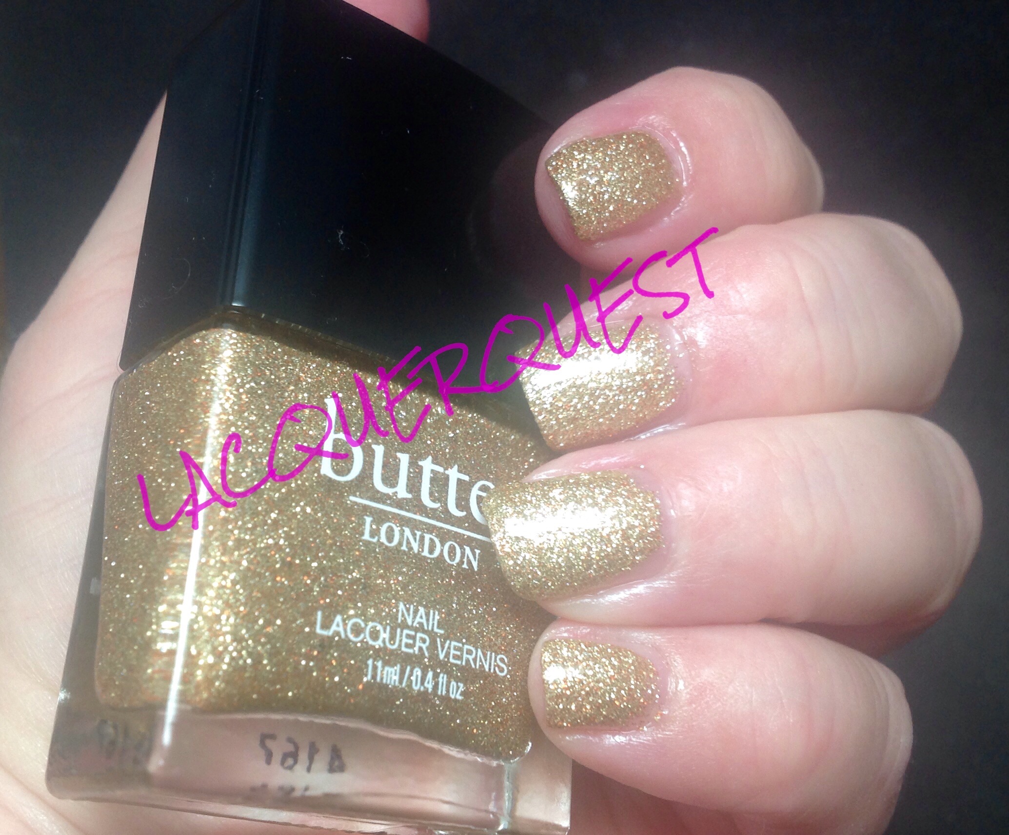
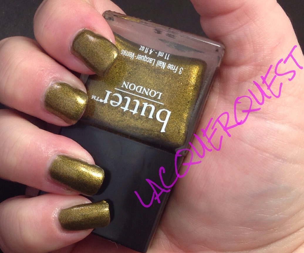
So, with that in mind, let’s take a look at Wallis.  Yes, the bottle is upside down on purpose.  It’s got a huge, tall cap (that I think is an illusion to make it look like more than it is, because it’s hollow and you have to pull it off to get to the brush) and holding it the other way my fingers cover up the color.


image

This came out a couple of years ago (might have been for the Queen’s Jubilee (because, again, Seattle….) and I got this and Bluey at the same time.  Now, I ADORE Bluey and, to be fair, a couple of BLs are among my favorites.  But $15 a pop is too much to be doing too many crapshoots.

Where were we?  Oh yeah, Wallis.  To be completely fair to Wallis, I don’t know why I got it.  I don’t even like the color normally.   I think I wanted West End Wonderland and ended up ordering this one.   I now must confess that when I went to their site to get links for those shades I caught  myself looking at some colors and going “oooh!”.  Then I slapped myself and closed it out but quick.  Curse you and your ways, BL!!!

Or I think I might have imagined it would be something like OPI Just Spotted the Lizard aka Chanel Peridot aka Jessica Irisdescent Eye aka China Glaze Rare and Radiant aka Color Club Editorial aka The Most Duped Lacquer on the Planet, a gold/green duochrome that I love so much I have a mini and 2 backups.

What I got was a metallic described as gold/olive green that looks more like cheap brass with a dirty patina.  To be honest, maybe it’s just my skin tone or some of the pictures I saw online while I was deciding on it weren’t based in reality.  I’ve worn this several times, trying to make myself love it and sometimes I get a little flash when the light hits it just right and I glance that way at the right time and I think I might like it.  Then I come back to reality.  It’s a little bit runny and I have to watch out for cuticle flooding and it’s a bit patchy after one and sometimes two coats.  But I won’t castigate it much for that, because that’s been my experience with a lot of metallics.

Poor Wallis, the homely outsider in my polish collection that I just can’t bring myself to dump.  Aptly named, yes?