A Few Words on … BOGOs

My mother relies on my sister and me for all of her transportation needs which, of course, includes her grocery shopping.  So we have a deal worked out that whichever one of us takes her gets Savings Catcher rights to her receipt.  My mom is a Catcher’s jackpot!  She buys brand names, does no price comparison and pays absolutely no attention to sales.  While reviewing my savings balance, I’ve noticed that I almost always get double because she buys two of everything.  So what does that have to do with nail lacquer?  Is the Quest turning into a multi-purpose personal blog?  Yeah, like I have anything interesting to say about a variety of topics, or even on the general condition of the human race….

So, again, what does this have to do with nail lacquer?  Read on, Macduff!

I, as opposed to my mother, live for store brands and sales!  But in thinking about it, I realize that I have inherited her habit of buying two of something.  Of course, in my case, I buy two of something if it’s on sale.  And BOGOs?  They get me weak in the knees and send me into a spiritual awakening….

For those uninitiated in the jargon of cheap bastardity, BOGO stands for Buy One, Get One (the free is implied).  I’ve mentioned the joys of BOGO in the past, along with my recent disappointment over no BOGOs at Ulta for their spring Beauty Steals.  But wait, didn’t I say that I didn’t really have any butterLONDON wants at the moment?  Yes, it was a mild disappointment, but still disappointing because I get excited over BOGOs whether I actually want it or not!

So you know where this is going, right?

Uh huh.  The day after Ulta’s BL steal, I get an email from Sally that they’re having a three day BOGO sale on all nail polish!  Except for OPI, of course.  It’s always excluded from super deals just about everywhere.  I’m not sure if the gels were included this time, sometimes they are, sometimes not.  I don’t really pay attention because I don’t use gels.  I have been using the foundation and top and curing them for a clear base under my regular manicures, but I don’t need colors for something that’s supposed to last 2-3 weeks when I get sick of my current color anywhere from 3 days to 5 minutes after I complete it.  Not to mention that it’s time consuming and labor intensive as hell to remove.  But that’s another topic for another Few Words….

Thing is, I try like hell not to go to any stores on the weekend.  Not only do I hate people aimlessly milling about, and crowded parking lots, and standing on lines at the register, Sally in general and my Sally in particular are tiny little cubbies with aisles like rabbit warrens.  And I like to take my leisurely damned time aimlessly milling about while perusing both the regular lacquer display as well as the clearance racks (which are located in various dark, crowded corners of the store).  And, I didn’t have a lot of interest, as I haven’t even paid much attention to the spring lines for China Glaze, FingerPaints or Orly (the only three at Sally that I consider other than OPI).  However, last time I was there they had a whole slug of China Glaze in the clearance rack that hadn’t yet been marked down and I had my reward coupon for March burning a hole in…..well, burning a hole in the passenger seat of my truck.  What, everybody doesn’t toss any possible coupon or deal circular directly into their vehicle?  You never know when you might be innocently tooling about on the streets when a sale breaks out!

So, I made a deal with myself that if I happened to get my lazy bahonka out of the house on Friday, I’d go check it out.  And, true to form, I only made it outside to check the mailbox.  Crisis averted!  But I wasn’t quite out of the woods just yet….

Now, the one exception to no weekend shopping is early Sunday morning.  I stay with my mother on Saturday nights and if I leave her house early enough on Sunday mornings while the faithful are in church and the sinners are sleeping it off, I’ll do store errands.  Best time hands down for Costco is when they open on Sunday.  Well, my brother was in time visiting so we went out to breakfast and all that family happy times stuff so I went straight home when I left shortly after noon.  Okay, crisis really averted!  As it turns out, not so much….

Since I didn’t go to sleep until 5 am (because I’m wild like that) and got woken up at the crack of 7:30 to go to breakfast, I went home and settled in for a little nap.  Aren’t Sunday afternoon naps the best?  So I woke up around 3, puttered around a little and suddenly got THE URGE to go check out Sally BOGO and clearance polish right damned NOW!!

What could I do?  Well, what any reasonable person would do.  I threw on some sweats, piled the bed head up into a hair claw and hit the road!

Well I get to Sally, hit the clearance rack and find out that all the China Glaze has been snagged.  Dammit, if only I would have gotten there before the sale started and the vultures descended, I might have been able to score some of the ones I was scouting.  (BOGO was a limit of three, so that gets saved for the full price stuff.)

So, eh…. I did manage to find two FingerPaints on clearance that I found acceptable.  Nothing completely spectacular, but at $2.29 worth the chance.  And really, the only full price polish I’ve had on my Get When on Sale List was China Glaze Dorothy Who? so maybe I’ll forgo the BOGOs this time…..

(insert maniacal laughter)

image

For those keeping score (like I supposedly do), that’s 2 China Glaze (the aforementioned Dorothy and Deviantly Daring, a duochrome I’ve looked at a few times), 2 Orly (I’m still mad about missing out on Mirrorball in their holiday collection) and 4 FingerPaint (2 on clearance).

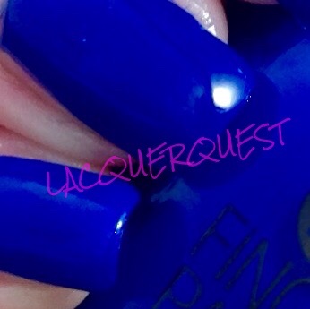
So, after the BOGOs, the clearance, my Sally Club discount and my % off coupon, I got 8 bottle of nail lacquer for well under $3.00 each.  And I’ve already used one of them that ended up being something perfect that I’ve been looking for a long time now and nothing I get has been exactly right.
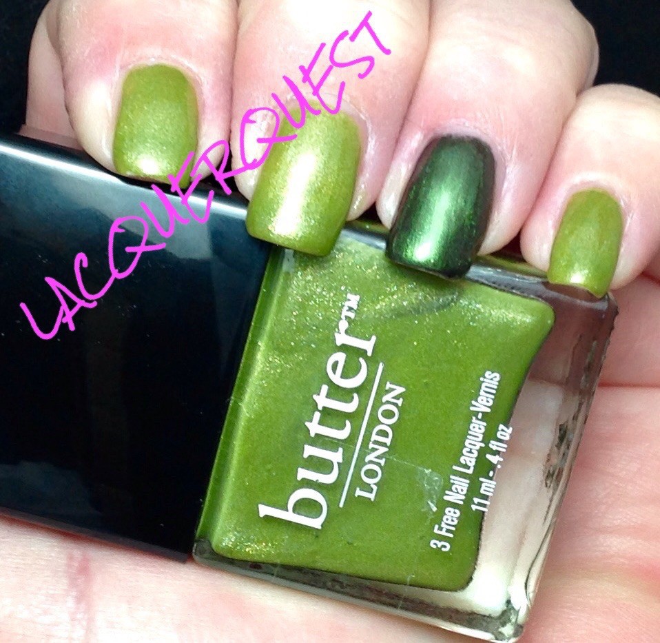
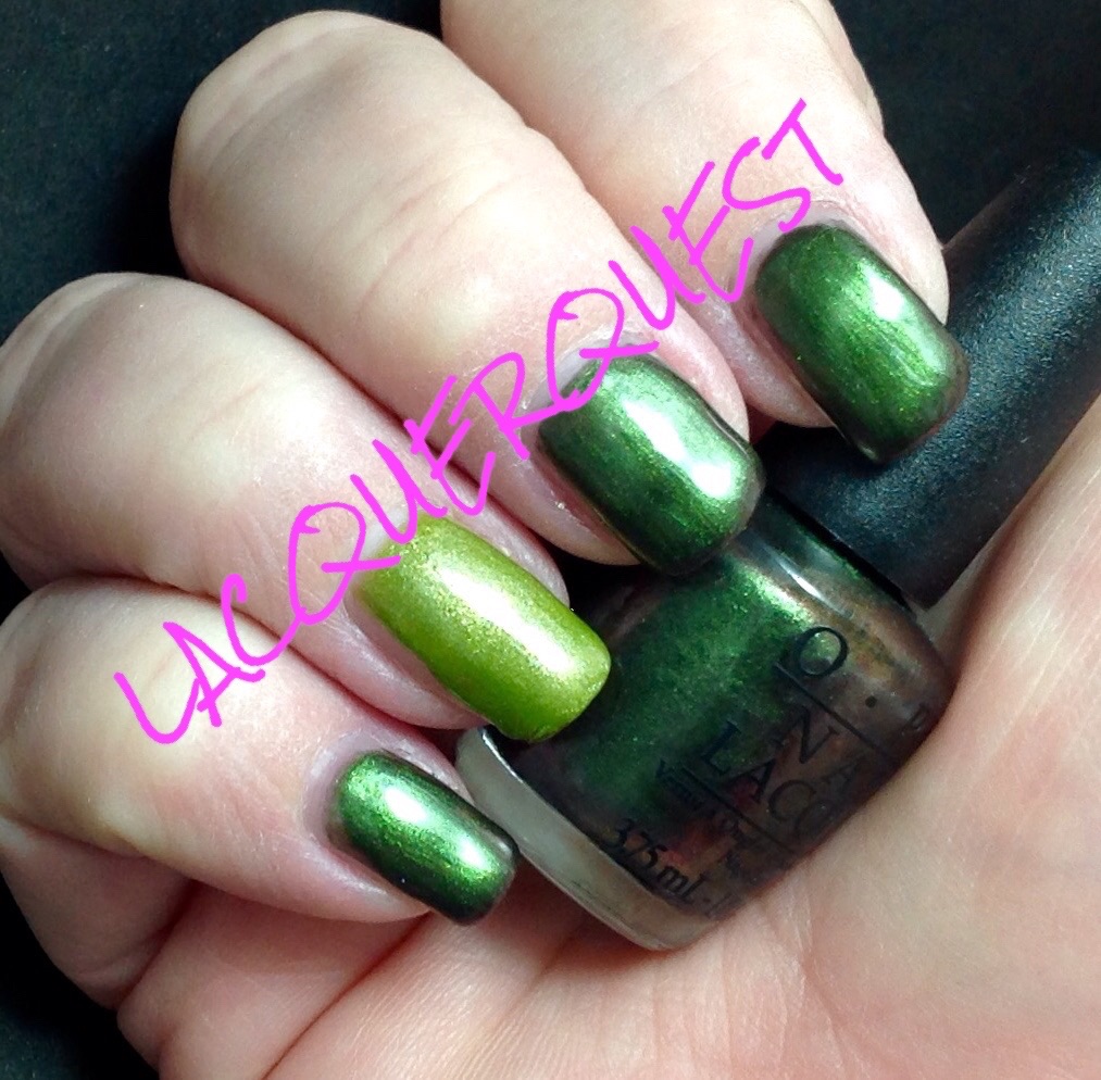
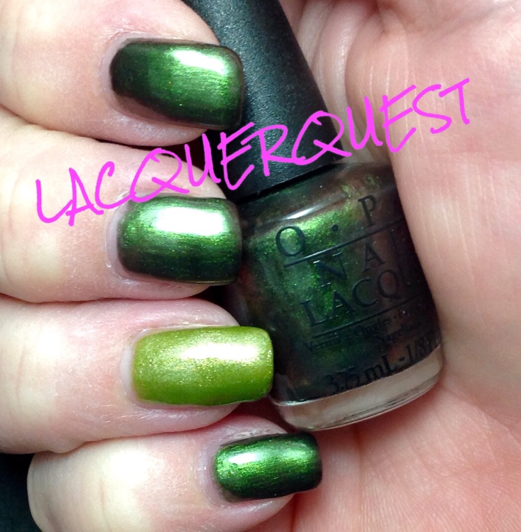
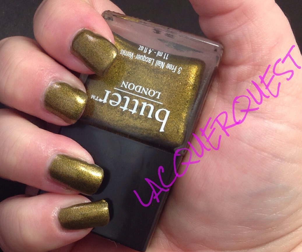
Sneak peek!

image

So job well done, right?  Yeah, I’ll just keep telling myself that….

Advertisement

butterLONDON – Dosh

This is the second half of this year’s St. Patrick’s Day manicure.   As I mentioned in my previous post, I used two colors, one for each hand with an accent nail in the opposite color.

Dosh is a color that BL describes as a metallic apple green shot with gold.  I really don’t get the shot with gold from it and think it’s a bit darker than apple green, but that’s an acceptable comparison.  It’s not yellow enough for chartreuse and not green enough for pea soup (thank goodness!), so I would classify it as a spring or leaf green.

Other than very specific shades, green is among my least favorite colors.  And yellowy-green is definitely not among those few shades!  So why did I even buy this when it looked even more pukey online?  I have no idea, the most reasonable explanation I can come up with was that I was either a) stoned at the time or b) drunk from the fumes of 50% clearance plus 30% coupons.  I’d bet on the latter, but not ruling out the former….

So I’ve had it for a while and have not even been tempted to use it because the color is atrocious.  Then when I was browsing through greens for St. Pat’s looking for something different…. I landed on Green on the Runway.  Ha!  After that decision was made, I figured that I’d go ahead and break ugly little wallflower Dosh’s maiden by giving it an accent nail.  Then a funny thing happened on the way to the ball…..

I absolutely love it!  I know, right?  Crazy talk!  But, there it is I like posh Dosh and I can’t deny it.

image

As I’ve mentioned before, Seattle’s own butterLONDON’s conceit is giving their lacquers British-y type names.  (Their website is even worse, it’s full of terms like bezzie mates and the like.  Come off it, you’re American!)  Dosh is slang for money.  I don’t know why.  I’d say it’s because it’s green, but I’m not sure that British money is green.  Somehow I have the idea that it’s like Canada and all different colors.  But maybe that’s just because they all have Queen Elizabeth’s picture on them.  I’m not sure if the term “monopoly money” is considered derisive or not, but I choose not.  Because I was raised on monopoly and loved all of the money and I also love Canada’s money!  It’s so pretty and ours is so boring…

Aside: (you knew it was coming…) I’m assuming that British money has always had the current monarch on it but, since I wasn’t even a distant thought when ER II took over the place, I have no idea what the money looked like before that.  I’m assuming that Ed 8 wasn’t even on the chair long enough for the mint to change over from his pops, but was WWII already in high enough swing where the money making was slowed down before they got George VI going?

And do they have plates made up and ready to go for when the inevitable happens and they can get the new mug on the money ASAP?  If so, how long have they been holding Charles in abeyance?  And have they had to redo the engravings as he’s aged?  Do they have the William plates already engraved just in case Charles either turns it over to William or passes before his mom?  Or that he’s of an age to where he isn’t going to be on the money for long so they might just skip him as a cost cutting measure?  Although I wouldn’t put money (ha!)on that, since he seems to have longevity on both sides.  Even more so than the Queen, I’ve got to give props to the Duke of Edinburgh.  They both just keeping going, and going, and going….

So there you have it, that’s the kind of stuff I think about when I am contemplating nail polishes.  Scary, huh?  If any English types are reading this, hit me up in the comments and fill me in on this because my curiousity is only exceeded by my laziness in actually looking up stuff on the internet….ha!

Where were we then?  Oh, yeah.  Dosh.

image

Although it’s classified as a metallic, I’d put it in that hazy, middle of the road spot between shimmer and metallic.  It’s more sparkly than a shimmer, but not quite as pronounced and shiny as a metallic.  It also goes on much better than most metallics.  A little streaky on the first coat, but smooth as silk afterward and leveled beautifully!  This is three coats and there was no VNL at all.

So am I rapidly becoming a BL stan-girl?  I don’t know if I’d go that far, but I do love Dosh way more than I should and I can definitely see putting this in my regular green rotation amid the teals, sages, and emeralds.

OPI – Green on the Runway

For St. Patrick’s this year I used two different greens, OPI Green on the Runway and butterLONDON Dosh, with an accent nail of the opposite color on each hand.  I’d planned on just using Dosh as an accent but, once I got it on the nail I loved it so much that I decided to give it a entire hand by itself!  And according to my (admittedly small) sample poll, the Dosh hand won… well, handily!

So which review am I doing first?  Green on the Runway, of course!

But first, an aside: (because I never do that…)  How much do I love LunchMoney Lewis?  A lot!  That snappy piano on Bills never fails to make me happy when I hear it.

Back to the business at…hand!  Can you tell it’s just shy of 5 am and I’m apparently a bit punchy?  So, Green on the Runway… This was from the Coca-Cola collection put out by OPI last summer.  For some reason, neither my Sally or Ulta ever got these in stock.  So I ended up getting the mini-set.  As luck would have it, instead of putting out a mini-set with the usual four colors, this was a 10 pack with 7 of the 8 colors with a mini top coat and mini Nail Envy.  The only one they left out was an orange glitter that I had absolutely no interest in, so I was all over that for under 20 bucks on eBay!  Good news, I really liked several of them. Better news, there were none that I was absolutely so crazy about that I just had to have a full size.

This one was supposedly inspired by Sprite, but have no idea why.  It’s a dark, blackened green duochrome with flashes of brown and maroon.  Not Spritely at all.  Nicole by OPI is putting out a Coca-Cola collection this year and the Sprite in that one is much closer to the Sprite can.  It might already by out, but the only place I ever see NOPI is the grocery store and Wal-mart and I generally don’t scout out the nail polish displays in either of those places.

image

It’s so hard to show duochromes in a picture, but you can kind of see brown cast in the bottle.  Not great, since it’s a mini, but it’s there. The blackened part of the green shows up a little better in this shot:

image

This was three coats and I think I might have been able to get by with two, or at least a thinner coat for the third.  Like most duochromes, the first coat was just brown and maroon smears with a hint of green, but it covered really well with the second one.

I’m really not a green person, but the blackening gave this a bit more interest.  And while reddish-brown is certainly not my first choice for a duochrome flash, all duochromes tend to fascinate me.

So, much like it’s inspiration (Sprite), Green on the Runway isn’t my first, second or even third choice and I’ll generally leave it on the shelf, but every once in a while a couple sips of a nice cold one really hits the spot.

OPI – Gargantuan Green Grape

Yes, I’m finally getting to the one I sneak peeked a while back!  I have kind of a love/hate relationship with this polish, for reasons that will become evident…

Gargantuan Green Grape came out way back in 2005 in the Summer Brights Collection!  I actually had to look this up because I wouldn’t have taken this for a bright.  Then again, another one I have from that collection is Significant Other Color and that one is definitely not a bright, so who knows?  So GGG has been part of the core line forever, if you call ten years forever, which I do.  In the land of nail lacquer, that’s an eternity!  They brought this out in a matte version in 2009 back when everybody and their sister was gaga over mattes, but I avoid them like the plague so I don’t have any of those.

.Like most white based pastels, it’s a nightmare to work with this one.  It’s thin, streaky, patchy, you name it.  But I put up with it because I loved the color and there really wasn’t anything close to it, (I’ve since found alternatives, which I’ll go into below).  There are other mint greens, sure, but they were either too blue, or too dark, or had a shimmer, or whatever.  This was the perfect light mint green pastel creme!  Well, except for actually using it…..

Ggrape

“So what’s the problem?” you might say.  “Looks okay to me.”  Well, I’ll tell you.  For starters, you’re looking at six coats there, ladies and gentlemen.  That’s right, SIX persnickety, careful coats!  So six chances for everything to go terribly, terribly wrong.  For instance, you might notice that dent in the ring finger.  Yep that happened when I knocked it against a bottle on the end table reaching for the Seche Vite.  At that point, I damn sure wasn’t going to try to take off the polish on one nail to do over, because we all know in that way lies madness.  This happens so often that I finally faced facts and realized that I had to do something.  Options included:

  • Cleaning off the damned end table (I’ve tried that before, somehow it replenishes itself when I’m not looking)
  • Paying attention to what I’m doing when I’m reaching for something (Squirrel!!!)
  • Getting one of those grabby things from Sally to use with cotton balls so I won’t mess up the other fingers

I’ve always laughed at those things.  Like what kind of delicate flower needs an implement for a cotton ball so that their delicate little fingertips won’t get sullied.  It’s like people who use a bridge stick when they play pool.  Just swing the cue behind your damned back like a grown up and carry on with it!  Or using tongs to pull food out of hot grease.  Don’t be a baby, that’s what long nails are for!

Anyway, I didn’t get the grabby thing for a while, so I can’t promise there aren’t any more blemished nails coming up, but sometime after this I reached my breaking point and got one.  Behold!  So simple, yet so useful!  The only concession I’ve had to make is that I buy those big-ass cotton balls and the claw can’t contain all of their awesomeness at once.  So I have to cut them down, which makes them last longer. So all the better, I guess.

But, onward with the touchy little number that is Gargantuan Green Grape.  You have to be careful with the application.  It’s hard to get a good cuticle line as it’s prone to flooding, so it’s necessary to leave room for the Holy Ghost (it’s a Catholic thing…) and hope for the best.  And if you try to just brush it on, you could put on 33 coats and it would still be streaky.  Instead you sort of turn the brush horizontally and lay the polish down on the nail instead of just brushing it across.  But, the results were usually worth it, until….

I got a butterLONDON polish called Fiver.  I’ve had it so long that I don’t remember the circumstances behind it, but I’m sure it was some kind of a sale (natch).  Then I got it home and compared swatch sticks and it looked just like GGG.  Damn!  I could have gotten whatever other color I was considering.  But I loved this one soooo much!  Everytime I love a color soooo much, I’m sure to have at least one, usually several, just like it at home.

However, while it’s not a perfect application (it is a white based pastel, after all) it’s a complete dream compared to GGG.  Good going, BL!  So that solved that.

Fast forward to this year’s OPI collection for spring, Hawaii, and I’m not completely thrilled with it, but they have one I really love.  That’s Hula-rious!.  Yeah, that’s highlarious, OPI.  But I wised up and decided the reason I like it is because it looked like GGG and Fiver.  Not going to be fooled again!  Then I got the mini set (my mini set addiction is worthy of a complete post of its own) and that was one of them!

Around the same time I also picked up an OPI base coat called Put a Coat On! on clearance at Sally that’s supposed to be used with brights and neons to intensify them.  It’s a solid white so I got it thinking it might help those multiple coat polishes that are such a hassle.  The following is the results of those labors.

image

From left to right:  That’s Hula-rious!, Gargantuan Green Grape, Fiver.  As you can see from the bottles, Hula-rious is way different.  That also might be a reason that I didn’t like it as much as I thought I would, so the mini will do me fine.  The GGG and Fiver don’t look a whole lot alike, but maybe that’s because of the different bottle, because they’re a lot closer on the nail.  Observe….

image

From index to pinky, that’s Fiver, GGG, Hula and GGG with the white base coat.  As you can see, Hula isn’t even in the same ballpark, much more yellow. So much so it makes the other look practically blue in comparison and they don’t look blue at all on their own.

The Fiver looks a skosh lighter in the picture than GGG (they’re practically  bang on in person) but that could be because that’s SIX coats of GGG to THREE of Fiver.  And I could have gotten away with two coats, but I did three on Hula so I wanted to have an even comparison.  Even with SIX coats, you can still see bald patches on the GGG.  To be totally fair, I didn’t top coat any of them and that might have helped.  I also didn’t baby it as much as I would have if it was going to be an actual mani.

I have to give a big pinky up! to Put a Coat On, though.  While it looks a little patchy in the picture, it didn’t seem that much in person.  Also (hold on to your hat), that’s only two coats.  TWO!  Had I noticed the patchy, I would have done another coat and I usually do three anyway.  As for the base coat, it was such a solid white that I thought it might go on like Liquid Paper.  No way!  It went on smooth as silk and was completely opaque in one coat!  I’m going to try it with some of my other really sheer but not necessarily patchy polishes to try and reduce the VNL.  Never mind that i have like half a dozen different whites for that purpose…..ha!

Speaking of green, I had what I thought was a pretty cool mani for St. Patrick’s Day so that might bump a few others back, just to be somewhat timely.  Yes, it irks me that St. Patrick’s color is BLUE, for God’s sake, not green!  And, yes, back in the day I was a smart ass who wore St. Patrick’s Blue and dared someone to pinch me.  But I’ve mellowed a bit since then and just go along with the masses these days.

But in looking through my to be posted manis just now, I do have one that could be deemed a nice St. Patrick blue that I had on shortly before this week.  Hmmmm….Maybe I’m still a rebel, just a subconscious one….

butterLONDON – Wallis

The lengths to which I have gone to love butterLONDON (hereinafter to be referred to as BL because….come on, ReAlLy??) are even more ridiculous than my China Glaze efforts.  At least my reasons for wanting to love China Glaze are sound: availability, affordability and selection. BL is pretty much the anti-a/a/s.

Availability? You can get it online or you can get it at Ulta.  I think you can sometimes find it in schmancy places like Nordstrom’s but that might only be in the Big Cities and I’m not going to the mall to find out!

Affordability?  $15 for 11 ml/.4 oz.  You heard that right, fifteen scoots for 4ml/.1 oz LESS than other brands.  Except for Julep and they’re just crazy ass.

Selection?  If you go online to their site I think they have a reasonable selection, but whenever I’ve gone to Ulta and wanted something specific, they don’t have it.  Racks and racks of other lacquers, maybe a couple dozen (if that) of BL.

And pretentious?  With all their fancy British references on their lacquer names and the actual name of their company you know where they’re based, right?  Yep, Seattle….

I mean, really, is a cool rectangular bottle that stacks together so nicely worth all that?  Apparently, because they’re still in business and I still keep swinging away whenever I see a B2G1 at Ulta (until last week!  But that’s another story for another time).

So, with that in mind, let’s take a look at Wallis.  Yes, the bottle is upside down on purpose.  It’s got a huge, tall cap (that I think is an illusion to make it look like more than it is, because it’s hollow and you have to pull it off to get to the brush) and holding it the other way my fingers cover up the color.


image

This came out a couple of years ago (might have been for the Queen’s Jubilee (because, again, Seattle….) and I got this and Bluey at the same time.  Now, I ADORE Bluey and, to be fair, a couple of BLs are among my favorites.  But $15 a pop is too much to be doing too many crapshoots.

Where were we?  Oh yeah, Wallis.  To be completely fair to Wallis, I don’t know why I got it.  I don’t even like the color normally.   I think I wanted West End Wonderland and ended up ordering this one.   I now must confess that when I went to their site to get links for those shades I caught  myself looking at some colors and going “oooh!”.  Then I slapped myself and closed it out but quick.  Curse you and your ways, BL!!!

Or I think I might have imagined it would be something like OPI Just Spotted the Lizard aka Chanel Peridot aka Jessica Irisdescent Eye aka China Glaze Rare and Radiant aka Color Club Editorial aka The Most Duped Lacquer on the Planet, a gold/green duochrome that I love so much I have a mini and 2 backups.

What I got was a metallic described as gold/olive green that looks more like cheap brass with a dirty patina.  To be honest, maybe it’s just my skin tone or some of the pictures I saw online while I was deciding on it weren’t based in reality.  I’ve worn this several times, trying to make myself love it and sometimes I get a little flash when the light hits it just right and I glance that way at the right time and I think I might like it.  Then I come back to reality.  It’s a little bit runny and I have to watch out for cuticle flooding and it’s a bit patchy after one and sometimes two coats.  But I won’t castigate it much for that, because that’s been my experience with a lot of metallics.

Poor Wallis, the homely outsider in my polish collection that I just can’t bring myself to dump.  Aptly named, yes?


Zoya – Ivanka

This was my manicure for Saint Patrick’s day.  Even though green is not the color of St. Patrick (it’s a shade known as St. Patrick’s blue), I am merely an American of Irish descent, so when in Rome….

image

Ivanka was part of  of Zoya’s Sparkle Collection for the summer of 2010 and is now in the permanent line.  I have another one from that collection (also permanent) called Charla.  But that’s a special one that I save for when I need to feel extra good about myself, so let’s hope I don’t get to that one for a while yet!

Ivanka is a beautiful emerald green.  Not that shade of emeralds that you and I own, but the shade of emeralds that most people couldn’t afford in two lifetimes. My birthstone is emerald, so I have one emerald ring just for form but it’s somewhat small and more of a leaf green.

Zoya classifies this as a metallic, but it’s got so much more going for it!  It’s packed with so much micro glitter that it’s practically a foil, but so smooth that it’s more like a glass fleck.   It’s just like beautiful foiled wrapping paper that has just the slightest touch of a lighter green-gold as you wave your fingers back and forth in an admiring manner.

For so much micro glitter it’s a tremendously easy formula to apply.  The first thin coat gives a nice, sheer look and is even light enough that you could wear it over a lighter color if you went really thin.  A reasonably thick second coat would have given it full opacity, but I went with three thinner ones instead, just because I like to use the third one as a finesse coat rather than a coverage one.


China Glaze – Turned Up Turquoise

Turned Up Turquoise was introduced as part of China Glaze’s Ink Collection from the summer of 2008, but is now part of the permanent line.  The collection was somehow related to tattoos, although any connection to either the colors or the names is beyond me.

I really want to love China Glaze, I’ve tried to convince myself to love it, I’ve kept buying it to try and force myself to love it.  It has a cool name, scads of colors, is priced on the lower end of the salon brands and is readily available at Sally Beauty Supply, which is my favorite beauty store and just down the street from me.

I don’t love China Glaze.  I like it, but I don’t love it.  There are a couple of them that I love, For Audrey and Make a Spectacle, for example.  But the rest of it is kind of take it or leave it.  Now that OPI has finally agreed to let Sally carry their line, my consumption of China Glaze will tail off dramatically.

The only reason I got this one was because it was in an ombre set of four colors called Wait Teal You See that was at a great price.  I think this was some time last summer and, while I wouldn’t have gotten it separately, I like it enough that I’ve worn it maybe two or three times since then.

This is kind of a strange one.  It’s marketed as a neon and, while it’s certainly bright, it doesn’t have that vibrant, knock you out punch that I associate with neons.  However, like most neons, it does dry matte.  It looks so different that I took pictures before and after top coating.

image

This photo was taken after three coats of polish.  Mattes tend to dry super fast and this one is no exception.  But then give it a little Seche Vite magic and…

image

Voila, it’s now a sleek and glossy sight to behold!  By the way, for those who have been wondering what in the world is this Seche Vite I keep carrying on about and what’s the big deal anyway, I’ll be devoting an entire post to this miracle in a bottle in a few days.

While the color in the pictures is lovely, it’s not accurate at all.  TUT is actually a green turquoise and skews heavily to the green side of green-blue.  This is apparently a common problem with this polish as I’ve looked at other pictures of it on the internet and far better photographers than I get the same blue and comment on it.

There used to be a toothpaste that was a green gel with a bluish tinge, but I can’t remember the name. Gleem, maybe?  The next best comparison I can think of is to take regular Scope and toss in a dash of the Blue Mint Scope and there you are!

The first coat, and maybe even the second were pretty streaky, which is common with neons, but they dried so fast it waa no real hardship.  I remember the third coat being thick and giving me a few globs, but I don’t see them on that first picture, so they might have been on my left hand.  It all got sorted with the top coat, but if you like rocking the matte look, be careful to make sure that last coat isn’t too lumpy.

OPI – Stranger Tides

Well, my pictures are looking a little ragged and my nails aren’t much better, but if everybody waited for everything to be perfect then not much would get done, now would it?  So, let’s just say to hell with it and light this candle!

OPI does two full collections in the spring and fall with geographic themes (this spring it’s Brazil).  In between those, they do a small collection which is generally tied in with a summer movie (this year it’s Muppets Most Wanted).  In 2011, the summer movie was Pirates of the Caribbean: On Stranger Tides and this polish is from that collection.

image

With the exception of a few shades that I love, I’m not much of a green fan (nail polish or otherwise) and never would have gotten this if it hadn’t been part of the mini bottle set.  Which is one reason that I love minis, because so often those polishes that I would never buy separately become favourites.  Such is the case with Stranger Tides.

From the outside of the bottle it looks like sickly pea green.  On the nail, it becomes a soft sage that’s dirtied up to give it some interest.  I really love colors that might otherwise be pastel when they’re muddy and grungy!  This one becomes surprisingly neutral when wearing it, not the same old boring beige and taupe, but also not one that screams GREEN!! at you.

There aren’t many that do a good old fashioned creme like OPI does and Stranger Tides is no exception.  The first coat is a little streaky, but not nearly as much as most light greens and blues are, and it evens out beautifully with the second coat.  Although I could get away with two coats on most polishes, I usually give an extra one for the Corps.  Just because….

Top it off with a coat of my beloved Seche Vite, and there you have it!  I like this one so much that I not only purchased a full size bottle in addition to the mini, but I might have gone overboard (ha!) and purchased several.  I need to do something about this back up compulsion of mine….